

Good chocolate packaging design gives a shopper a clear answer before it asks them to admire the artwork: what chocolate is this, which flavor or origin is it, and why does this pack belong in this range? For an artisanal bar, that can mean a restrained front with one distinctive cocoa or place cue. For a premium gift, it may mean a coordinated outer presentation and a deliberate opening sequence. In either case, the design must work on the filled package, with room for product information and an opening that suits the chocolate inside.
Begin with the actual selling unit, where it will appear, and how it will be used. Choose a visual idea that can repeat across flavors; test it at shelf and thumbnail size; then put it on a physical pack alongside the real product. A creative shape, metallic detail, vintage border or dramatic illustration earns its place only when the person buying or receiving the chocolate can still identify the product and handle the package comfortably.
This guide offers design directions and a way to select among them. The photographed pouch examples below are published Mylarbag projects; outside design-studio examples are attributed to their creators. Neither a photograph nor an illustrative AI scene demonstrates a customer's sales result, a validated food-contact construction, or a finished-pack shelf life. Those questions belong to the specific product and supplier brief.
Decide what the package needs to do in the buying moment
The same chocolate can face very different design conditions. A single bar in a specialty shop may sit on a narrow shelf edge with only part of its front visible. An online product photo becomes a small rectangle among other listings. A mixed-flavor set is often seen as a gift before any one bar is inspected. A tasting square may be held in a hand or placed in a tray rather than standing upright. Write down the primary situation before choosing a visual treatment.
Make a short brief with the product form and amount, the intended sales unit, whether the chocolate already has an inner wrap, the likely display orientation, the number of variants, and the market where the label will be used. Add the action expected after purchase: one tear and immediate eating, repeated access to bites, or opening a presentation box and then choosing an individually packed piece. This makes the design problem concrete. It also stops a large gift-box rendering from silently becoming the specification for a small flexible pouch.
| Selling situation | What the customer should grasp first | Useful design review |
|---|---|---|
| Single bar on a shelf | Brand, chocolate type and flavor or origin | Place the filled pack beside competing formats at its real visible size. |
| Multi-flavor bar range | Shared brand system and unambiguous variant | Arrange all SKUs together and ask someone unfamiliar with them to pick a named flavor. |
| Small tasting portion | Product identity despite limited panel area | Check a hand-held sample after seals and opening marks take their space. |
| Gift assortment | Occasion, contents and a coherent reveal | Follow the opening sequence from outer wrap to each edible item. |
| Online listing | Recognizable front at thumbnail scale | Check the first image on a phone, then examine the full back and side separately. |
These are review prompts, not a claim that one treatment will sell more. If a design works only in a full-screen mock-up, it is still a concept. If a bar is photographed without the carton, pouch or sleeve that customers receive, the online image is missing part of the design. Keep the actual format in the review from the first sketch onward.
Give the front a hierarchy that survives the real pack
Begin with three pieces of information: the brand, what kind of chocolate it is, and the distinction that matters for this SKU. A maker may lead with a place, cacao percentage, inclusion or flavor; the order depends on the product and the brand promise. The key is to pick an order deliberately. A large decorative name with a tiny product descriptor may look luxurious in a presentation deck and become confusing beside other snacks.
Work on the front panel at actual scale. Print a rough version, fold or place it on a representative pouch, and view it from the distance at which the package will be selected. A rich brown background may make a pale flavor name feel elegant up close, but the contrast could disappear in shadow. A detailed cocoa-pod image may read beautifully at poster size yet turn into an indistinct patch on a narrow sachet. Reduce the number of simultaneous messages until the pack communicates one clear reason to take a closer look.
The published bean-to-bar flat pouch project offers a visible example of a light field, dark chocolate-colored graphics, a bordered central brand panel and a red accent. The public record lists a 12.7 × 15.3 cm flat pouch, gravure printing and Spot UV. Read the image as an appearance reference: it does not establish whether those colors, copy size or proportions will suit another bar.

Review the back at the same time. A front-heavy concept often sends every practical word to a narrow back panel, leaving the barcode on a curve or an ingredient block interrupted by a seam. Set a quiet information field early, then let the expressive artwork grow around it. This is a design decision with a physical consequence, not a last-minute production cleanup.
Pick a design language with a specific job
There is no required visual formula for artisanal chocolate packaging. A small maker with a strong sourcing story, a playful inclusion range, and a formal gift collection can all be premium in different ways. Ask what each cue communicates and what it costs in clarity or space. The following are starting directions for a real brief, not templates to copy from another brand.
| Direction | A useful place to apply it | What to protect from the decoration |
|---|---|---|
| Ingredient or origin cue | A bar where the place, cocoa or inclusion is a real differentiator | The precise, approved product description. |
| Quiet luxury | A compact range with strong type and one restrained accent | Enough contrast to identify each flavor at a glance. |
| Vintage reference | A maker with a documented heritage or a deliberate nostalgic tone | Modern readability and a truthful account of origin. |
| Artist-led pattern | A brand with a real collaboration or collectible series | Stable brand and product markers across changing art. |
| Product window | A pack where a visible piece answers a buying question | Protection, information area and the appearance of the actual product. |
| Unusual shape | A gift or bar format where structure adds a useful reveal | Filling, protection, packing and realistic retail display. |
Let the chocolate story select the motif
An origin-led bar can draw from a real landscape, harvest process or flavor note, but the visual should be specific enough to justify its presence. “Single origin” text, a generic plantation silhouette and decorative beans are three separate claims or cues; do not combine them just because they look artisanal. If a place or farming story is central, the brand must be able to substantiate the wording and use imagery respectfully. If the distinction is a toasted inclusion or fruit pairing, a carefully chosen color and small ingredient photograph may say more than an unrelated map.
Art can be a genuine positioning device. The design studio Freytag Anderson describes its COCO work around “The Art of Chocolate,” developing a brand relationship between commissioned art and chocolate. The lesson for a new maker is the system: keep a recognizable name, product descriptor and range behavior while artwork changes. Do not reproduce another brand's illustration or use a commissioned artist's work as free decoration. Brief a collaborator, agree rights and decide which fixed elements anchor each edition.
Use restraint, contrast and tactile cues deliberately
Luxury chocolate packaging often needs less visual noise rather than a larger collection of shiny effects. A strong typographic hierarchy, substantial negative space and one controlled finish can help a small bar feel considered. Decide what a finish points toward: perhaps the brand mark, an origin detail or a gift seal. If every border, bean and word receives the same emphasis, the first glance has no destination. Inspect the chosen finish on the actual surface under ordinary shop lighting; a screen cannot show how it behaves on a filled pouch.
For a vintage chocolate packaging direction, choose a period reference that supports the brand story, then edit it for modern use. A fine frame, serif title or archive-inspired color can signal heritage without making the flavor unreadable. Avoid implying an old founding date, geographical provenance or inherited recipe that the brand cannot document. Test the smallest type and the darkest color combination on a physical sample. A pleasing historical mood does not excuse unclear ingredient or allergen information.
Build one family that can identify every flavor
Designing one beautiful pack is easier than making twelve packs readable together. A range needs fixed elements and variable elements. Fix the position and relative scale of the brand, chocolate type, net quantity field and principal information zones. Reserve a consistent area for flavor, percentage or origin. Vary a color, motif or ingredient cue in that area so a shopper can select the right SKU without learning a new layout each time.
The published 3 oz artisan chocolate project shows four colorful printed variants in its gallery. The public page lists digital printing, a MATT OPP/white kraft/VMPET/PE construction and a 13 × 21 cm size. Its title calls the product a stand-up pouch, while the format field calls it a three-side-seal flat pouch. Treat the gallery as a visual range example and ask for a current drawing before using its dimensions, opening or panel behavior as a design model.

Make a range sheet, not four separate beauty shots. Put the SKUs in alphabetical or shelf order and check whether dark, milk, nut and fruit variants remain distinct in low light, at a phone thumbnail and for a person who cannot rely on hue alone. Color should support a written product distinction, not replace it. If two flavors use similar ingredients or percentages, give each one a second independent cue such as a name, icon shape or image placement that remains clear in grayscale.
| Element | Keep consistent across the range | Change only when the product requires it |
|---|---|---|
| Brand block | Position, scale and typography family | Licensed collaboration or a formally approved sub-brand. |
| Product descriptor | Placement and reading order | Accurate dark/milk/white, bar/bites or other product identity. |
| Variant field | Reserved location and minimum useful size | Flavor, origin, inclusion, cacao percentage where accurate. |
| Graphic field | General composition and visual weight | Color, ingredient cue, region-specific pattern or seasonal motif. |
| Information panel | Clear zone, legible contrast and review ownership | SKU-specific ingredients, allergens, quantity and market text. |
| Code and pack identity | A planned flat location | Correct barcode and lot/date method for each selling unit. |
Keep a master range grid with one row per actual selling unit. A seasonal run may use a different colorway but still belongs in the grid. The grid helps catch a common mistake: an attractive new flavor quietly changes the location of the chocolate type or loses room for a required declaration. Review every SKU as its own product while keeping the visual family recognizable.
Simplify for a tasting square or single serve
A small square sachet is a different canvas from a full-size bar. The published 12 g dark-chocolate sachet is listed as a matte three-side-seal pouch with an 8 × 8.5 cm size and gravure printing. The photo shows that a compact pack can still carry a focused front and a separate back. It does not prove that its copy will meet another market's label rules or that its structure is right for a different piece of chocolate.

For this size, let one graphic cue do the work. If the brand name is prominent, keep the chocolate descriptor close enough that the product is clear. Avoid surrounding every line with ornament, especially near seals or the tear edge. Decide whether the sachet is sold on its own or inside a labeled multipack: the two selling situations can have different information and presentation needs. Have the brand's label reviewer confirm the specific market and sales unit instead of assuming that an outer box makes the individual pack irrelevant.
Put a printed mock-up over a blank sample and hold it at the angle in which someone will receive it. If fingers cover the only flavor cue, the composition needs revision. If a tear removes the name or a border runs into the sealed edge, move the information. Even innovative chocolate packaging can become quiet and useful when space is scarce; restraint may make the miniature feel more intentional than shrinking a larger bar design into the same area.
Make a gift feel coordinated from outside to inside
A gift is an opening sequence, not merely a box with a ribbon. The buyer sees an outer presentation. The recipient opens it, reads a note or flavor guide, then reaches a wrapped bar or individual piece. Decide which layer introduces the brand, which layer identifies the contents, and which layer stays with the chocolate if the box is discarded. A premium outer sleeve can make a simple, well-designed pouch part of a gift set without requiring the pouch itself to pretend to be a rigid box.
Design studio Backbone's “Truly Deeply” case describes a handmade chocolate gifting system built around a small recurring bunny motif and changing mood or occasion treatments. Billion Studio's Elite Collection case describes a chocolate gift-box range using an art-deco-inspired gold motif with bold color and a consistent black sleeve graphic. Those are attributed design examples, not Mylarbag projects and not evidence of increased conversion. What transfers to a smaller brand is the principle of a fixed recognition element alongside adaptable occasion cues.
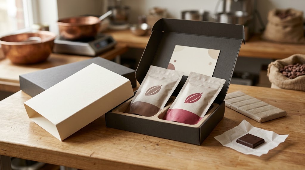
Map the opening with a real prototype. Can a person remove the sleeve without crushing a bar? Does a flavor guide remain visible after the box opens? Are individual packs easy to lift without touching unwrapped chocolate? If the gift includes multiple recipients or repeated servings, decide whether each unit must remain identifiable after it leaves the outer pack. The answers change both the packaging layers and the graphic hierarchy.
Seasonal editions should make a recognizable brand feel timely. Change a band, illustration, message or outer color while retaining the pack identity and the essential product information. Use the same physical test for the seasonal version, especially if a new wrap or insert changes thickness. A decorative layer that hides a barcode, crushes the pouch or obstructs the intended opening has defeated the reason for adding it.
Treat shape and opening as part of the concept
Custom shape chocolate packaging can mean very different things: a die-cut outer sleeve, an unusually proportioned carton, a shaped window, a tray for molded pieces, or a flexible pouch sized to a nonstandard bar. These are separate engineering requests. A shaped chocolate bar does not automatically require a shaped outer pouch, and a creative illustration can give a conventional pack more distinctiveness than a complicated cut edge.
For custom shape chocolate bar packaging, begin with the chocolate's true dimensions, thickness, break pattern and any existing inner wrap. Draw the sequence from filling to sealing to first opening. Ask where the bar can move, what protects corners, where the cut or crease falls and whether the customer can remove the bar intact. A narrow waist in a carton may look striking until the wrapped bar catches during insertion. A die-cut window may frame a piece in a rendering but reveal a blank inner wrap or a shifted product in the filled sample.
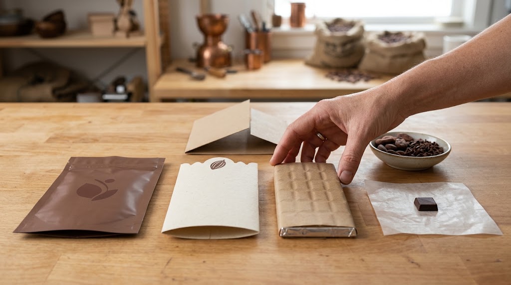
Separate visual novelty from function. A broad notch can invite a clean first opening; a zipper can support repeated access for loose bites when the filled pack and closure are suitable; an outer sleeve can carry a gift message without changing an existing primary pouch. Each feature needs space, a proposed structure and a test on the actual item. Do not promise that a zipper restores unopened protection, that a window keeps a product safe, or that a decorative carton solves warm-weather shipping. Those are different questions to validate on the complete pack and distribution route.
If the budget and schedule are tight, prototype a standard pouch with distinctive proportions, a disciplined graphic system and a removable occasion sleeve before commissioning a wholly new shape. This is a sequencing choice, not a claim that standard packs always cost less. Obtain comparable quotes and physical samples for the real formats under consideration. The right custom feature is the one a buyer can see, a recipient can use, and a supplier can make for the specified chocolate.
Reserve readable information space before the artwork is final
Label content depends on the product and destination. For a U.S. food product, the FDA Food Labeling Guide is a starting reference, and the brand's regulatory reviewer should check current ingredient, allergen, nutrition and net quantity requirements for each actual SKU. The guide itself notes that some sections are being updated. A supplier project photo is not a compliant label template, and this design article cannot approve one.
Place a defined information zone on the pack even while the words are still in review. Decide which face carries the product description, where the back copy can be read on a filled pack, and where a variable lot or date code will be applied. Leave room for the correct barcode symbol rather than squeezing it into the last available corner. GS1 US barcode guidance discusses contrast, quiet zones, smooth placement and the risks of resizing existing symbol art. Scan the actual printed finished unit under the relevant retail conditions.

A design with a large cocoa illustration can still leave an orderly back. Use contrast, line length and a flat placement that remain sensible after the pack is filled. Keep claims about origin, cacao percentage, organic status, recyclability or food-contact suitability out of a concept until the brand has the support needed for the particular product and market. The same applies to a vintage crest or a foil badge: visual authority should not accidentally imply certification.
The final dieline and print handoff are a separate production task. At this stage, mark the zones and create a physical design review so the later artwork can be prepared for the actual pouch. Do not set a universal seal clearance or assume a photographed pouch has the same panel geometry as the one you plan to buy. The public 3 oz page itself gives conflicting format descriptions; request a current drawing for that project if its shape is being used as a reference.
Review concepts as finished selling units
Limit the first design round to distinct directions that can be compared: for example, a story-led origin pack, a restrained typographic range and a gift-led collection. Give each the same product information and the same proposed physical format. If one concept is rendered on a large rigid box and another on a tiny flat sachet, the comparison measures format as much as design. Fix the buying situation first, then test what the visual system changes.
Put full-size front and back printouts on representative blank packs. Fill them with the real wrapped bar or a dimensionally accurate trial piece. Line up the range on a shelf, photograph it under normal light, and inspect the online crop at the size used in the listing. Hand the gift version to someone who did not build it and watch the first opening. Ask that person to identify the chocolate type and one flavor without coaching. Record the point of confusion rather than telling them what the picture was meant to say.
| Review stage | A useful question | What to record |
|---|---|---|
| Front at true size | Can the product and variant be identified? | Exact element or word that was missed. |
| Range together | Is the family recognizable while SKUs remain distinct? | Flavor pairs mistaken for one another. |
| Filled back and top | Can the text, code area and opening still be used? | Fold, bulge, seal or tear conflicts. |
| Gift opening | Does each layer have a purpose? | Difficult removal, hidden flavor or loose product. |
| Shelf and thumbnail | What remains visible at the actual viewing size? | Crop, glare, low contrast or orientation problems. |
| Supplier sample | Does the proposed format match the approved concept? | Format, finish and drawing revisions still unresolved. |
This is a qualitative design review, not a controlled sales experiment. Do not turn a favorable comment or attractive photo into a promised conversion uplift. If testing with customers is possible, define the question and method before looking at results. Even without that research, a disciplined physical review can remove avoidable ambiguity: the wrong flavor name, a barcode in a crease, a sleeve that traps the bar, or an illustration that disappears on the actual pouch.
Turn the chosen design into a packaging brief
For the next conversation with a converter, send the actual chocolate or a true-size sample, the target net quantity, inner-wrap status, intended shelf orientation, range count and versioned artwork. Explain which design elements must remain constant and which change by SKU. State the desired pack format and finish as a proposal, together with the sales markets, information zones, opening behavior and any gift components. Ask what the supplier needs to confirm about dimensions, printable panels, material, sampling and production feasibility.
The three published Mylarbag chocolate projects illustrate different visible starting points: a compact 12 g sachet, a colorful 3 oz range, and a bordered bean-to-bar flat pouch. Their public appearance can inspire a design conversation; their dimensions, construction and performance cannot be transferred to an untested product by analogy.
Use the custom chocolate packaging bags page to discuss the flexible-pouch options available for a particular concept. Then contact Mylarbag with the product, target pack, quantity by variant and current artwork or mood board. Ask for a physical sample and a current drawing before approving a structure. A gift box, molded tray, foil inner wrap or other component may require its own specialist and should be included in the complete pack brief, rather than hidden inside a request for “a premium chocolate bag.”
Frequently asked questions
How do I design chocolate packaging for a small artisanal brand?
Start with one actual bar or portion, its selling unit and where customers encounter it. Choose a clear brand, product and variant hierarchy; put it on a full-size sample; then design a simple range rule for future flavors. Keep room for the copy and codes your market needs. A single polished rendering is less useful than a front-and-back mock-up filled with the real product.
What makes chocolate packaging look premium?
Premium is a coherent decision, not a particular color or foil. Consistent typography, a confident front hierarchy, carefully used empty space, an appropriate material appearance and a considered opening can work together. A selective finish may reinforce one focal point, but it needs a physical sample. Clarity about the chocolate and truthful product information remain part of the impression.
Is vintage chocolate packaging a good fit for a new brand?
It can be if nostalgia supports the positioning and remains legible. Borrow the visual grammar of a period, such as a border or type proportion, while making the current product name and ingredient information easy to read. Do not imply a historical founding date, recipe or place of origin that the brand cannot support. Test the printed result at the actual pack size.
Should I choose a custom shape for a chocolate bar?
Choose a custom shape when the physical form improves display, gifting or opening enough to justify prototyping it. Start with the wrapped bar's dimensions and handling sequence. Compare a shaped outer sleeve or carton with a conventional pouch before committing to a complex primary pack. A drawing and filled sample should resolve fit, access and information placement before production approval.
How can multiple chocolate flavors share one design?
Fix the brand location, reading order and information zones, then change a defined color, motif and clearly written variant name. View the whole range together in the selling orientation and at thumbnail size. If two SKUs cannot be distinguished without color, add another visible cue. Review each SKU's actual label copy and code independently of the shared artwork.
Can a flexible pouch be part of luxury chocolate gifting?
Yes. A well-proportioned pouch can be the individually identified chocolate unit inside an outer sleeve, carton or assortment. Design the journey through those layers, including how the recipient selects and removes a bar. Confirm the pouch's actual protective and food-contact suitability for the product separately; a beautiful outer box does not establish those properties.