
Use CMYK for food photographs and gradients. For a brand color that needs to match an existing pouch, give the printer the approved physical reference and ask how the logo will be printed. One supplier may simulate the Pantone target with process inks. Another may mix a separate spot ink. If the process version meets your requirements on the finished material, you can approve it. If it misses, ask for a spot-ink sample on the same construction before authorizing the extra cost.
What did the printer mean by “Pantone matched”?
Imagine two quotes for the same trail mix pouch. The design has a green brand band, a photograph of the mix, and a window that lets the shopper see the nuts. Both quotes repeat the Pantone number from your brief. The first printer intends to build that green from the press’s existing inks. The second has priced a separate green ink for the band. Before comparing prices, ask each supplier, “What inks will the press actually use for the green band on this order?”
CMYK stands for cyan, magenta, yellow and black. Process printing combines these inks in varying amounts to reproduce many colors across an image. That suits a photograph in which a pecan has a light edge, a dark crease and a gradual change of tone between them. A spot ink is prepared for a particular color and printed as its own separation. On a press that supports the combination, the photograph can use process inks while the solid brand band gets its own ink. The white behind parts of the design is a separate artwork decision.
Ask the estimator to put the answer next to the item price. Useful quote language could be “brand green simulated with our four process inks” or “process image plus one separately mixed green.” A printer using an expanded set of process inks can name that set and state how it will produce the logo. A color saved as a named spot in the artwork can still be mapped to the press’s process inks. You need the output decision in writing before budgeting for a dedicated ink or promising it to the brand owner.
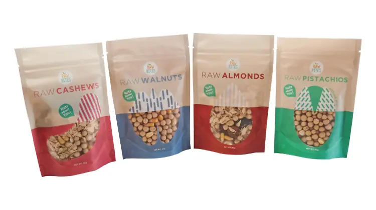
Look at the four packs in this printed nut pouch project. The upper panels share a layout. The panels around the windows help distinguish cashews, walnuts, almonds and pistachios. On a range like this, decide which element should look consistent across the family and which colors should help the shopper tell the products apart. Mark that distinction on the artwork. It gives the printer more direction than a request to match every color on a screenshot.
For comparable quotes, keep the order quantity, number of designs, film, surface finish and proof requirements the same. Find out which color setups, proofs and repeat-order charges each price includes. A lower quote that includes only a layout PDF leaves the cost of approving the actual film open. For a digital bid, the digital pouch proofing guide lists the color references and white areas to flag when requesting a sample.
Which physical color reference takes priority?
Put the brand guide and the last approved pack on the table. Suppose the guide specifies a coated-paper Pantone reference, but the pouch already on sale has a slightly different green. Ask the person responsible for the brand which one the new order should match. For a replenishment order, they may want the new lot to sit beside the previous one on the shelf. For a redesign, they may have deliberately chosen a new target. The printer cannot infer that decision from two objects that disagree.
Identify the reference well enough that someone can find it six months later. Record the full color designation, including the library and suffix, or the code on the signed pack. Note the guide edition if known, or the date, product and revision of the retained sample. Mark the exact part of the pack to match. A single front panel might contain a solid green, smaller green lettering and a photograph of green leaves. The solid band is a much more useful target than “the green on the bag.”
In the Pantone graphics system, C and U refer to how a color is represented on coated or uncoated reference paper. A matte pouch does not turn a brand’s C reference into a U reference. Pantone’s Color Bridge pairs a solid-color reference with a close CMYK simulation on the guide stock. Use the pair to decide whether to explore a process build. Ask the supplier to show what its ink set can do on your material. For the distinction between the two printed guides, see Pantone’s explanation of Formula Guide and Color Bridge.
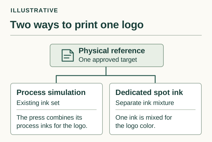
Table 1. Color brief to send with the artwork
| Artwork area | What the buyer provides | What to confirm before approval |
|---|---|---|
| Solid logo or brand band | Identify the exact area, full color designation and suffix, and priority physical reference. | Ask whether the proposed press will use a process build, an expanded ink set or a separate ink. Request any setup charge and agree which versions need a sample. |
| Food photo or gradient | Supply the artwork revision and mark the details that matter in the highlights or shadows. | Ask the printer to identify the process and proof condition. Decide whether that proof supports the image-detail decision you need to make. |
| White-backed panel, clear window or exposed metallic area | Mark each area, the intended appearance and the side from which it will be viewed. | Confirm the proposed film and the white or unprinted areas on the separations. Identify what needs to be inspected on a film sample. |
If you have only a digital logo and a HEX value, use them to identify the artwork, then ask the printer for physical candidates. Have the brand owner select one under agreed lighting, give it a reference ID and send or retain matching copies as agreed. Leave the color approval open until that choice is made. Otherwise the designer may keep comparing samples with a laptop while the printer tries to match a paper chip that nobody on the brand team selected.
What sits behind the logo on this pouch?
Take the green band on the trail mix design. On opaque white material, part of the background comes from the material itself. On clear film, the same area might need printed white behind the color to keep the contents from showing through. On a reflective construction, the designer may want some areas to show the underlying sheen and others to read as solid color. Tell the printer what shoppers should see from the outside of the finished bag. Let the printer specify the print sequence for the proposed construction.
Ask for a view of the color artwork, a view of the white separation alone, and an overlay showing where they meet. Start at a recognizable landmark, such as a corner of the brand band next to the window. Follow that edge through all three views. If the white extends into the window in the approved file, a well-printed job can still give you the wrong design. If the white stops short of the band where you wanted an opaque edge, ask the printer to check its planned alignment allowance before changing the brand color.
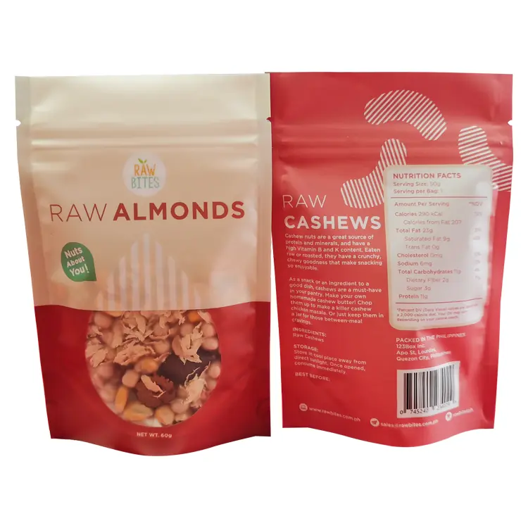
The left pack in the photo is the almond front. Look where the red field meets the shaped window. The pack on the right shows the back of a cashew pack from the same range. You can circle that window edge for discussion without guessing how much white went under the surrounding color. For a colorless window, confirm that the construction is clear through that area and that the artwork leaves it free of colored and white inks. Leaving white off an area of continuous metallized film will still leave the metal in view.
There are two different ways white can appear on an ink plan. White behind a colored logo provides a base for the logo. Visible white lettering is part of the design in its own right. Show both on an overlay and check the intended effect of each. Where reflective film is part of the design, our sister site uses a white-ink map for a holographic cannabis pouch to distinguish a reflective background, a colored panel backed with white and letters that print white.
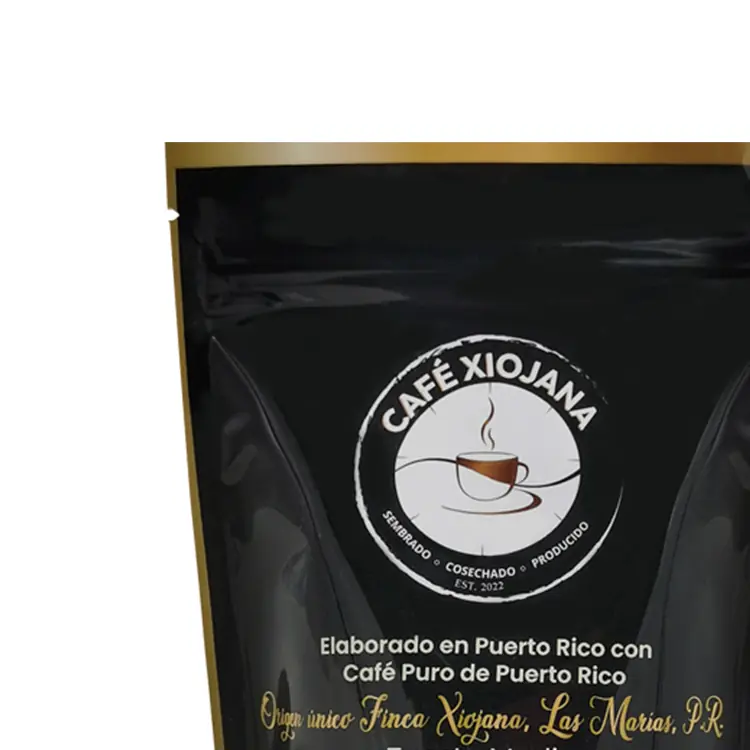
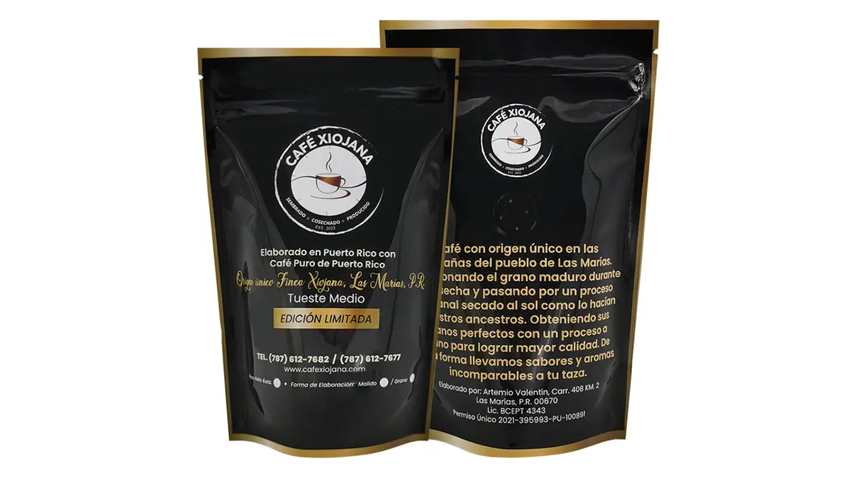
This black-and-gold coffee pouch is listed as digitally printed on PET/VMPET/PE, a construction that includes metallized film. The photo shows a pale circular logo, small light lettering and a gold-colored band. Those details warrant different proof questions. Is the small lettering clear against the dark field? How should the band look when the bag turns under the light? The published specifications identify the film and print method. To reproduce that band on a new order, the printer would still need an agreed physical target and the ink and artwork instructions for the new bag.
Which proof can you sign for which decision?
When a proof arrives, first read the label on the sample or the covering email. “Color proof” could describe a print on paper, a film sample from a different press or an impression taken from the intended line. Before signing, ask what produced it, which material it uses and what work had been completed when it was taken. An unlaminated piece of printed film and a finished pouch may carry the same revision number while presenting the color through different surfaces.
In an ordinary layout PDF, check the logo version, the spelling of the flavor, the position of the window and the areas assigned to white. Ask to see the white separation if the composite hides it. For the photograph, ask for a hard-copy proof that simulates the stated print condition. If the printer tells you which printing condition it simulates, you can judge the image for that condition, including whether detail survives in the darker parts of the food photograph. Write the simulated condition on your approval. Specifying that condition is central to ISO’s description of hard-copy proofing.
A drawdown is a sample made by spreading a candidate ink on a specified surface. It lets you compare the solid ink with a target before ordering a complete printed design. Turn the sample over and check the label. If the printer used a white test card, record that fact. If the sample is on the proposed film, ask which side you should view, whether it has the specified white behind it and whether the final surface has been applied. A green approved on the bare film can be a useful ink reference while the appearance of the laminated band remains open.
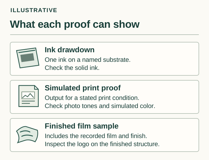
Table 2. Record the decision each proof supports
| Proof received | What it can help you review | What to identify or leave open |
|---|---|---|
| Layout PDF or composite | Review copy, placement and the separation assignments shown for that artwork revision. | Record the file revision and which separations are visible. An ordinary PDF does not settle appearance on the finished film. |
| Process-color proof | Review photo detail or process-color appearance for the stated simulated printing condition. | Identify the output medium and simulated condition. Keep the actual white layer, reflection or finish open if the proof does not reproduce them. |
| Single-ink drawdown | Compare the solid ink with the target for the specific sample setup. | Identify the ink, substrate, white base, surface and viewing side. Combined artwork and finished appearance remain open if they are not represented. |
| Press sample or finished pouch | Review the identified color areas and appearance that the particular sample reproduces. | Record the sample ID, press and ink set, film, white map, finish and artwork revision. Leave any differences from planned production open for review. |
For a consequential color decision, a signed note might read, “Artwork revision B approved for copy and window position. Hold the brand band for review on laminated sample B2.” That instruction lets prepress finish an approved task without giving the purchasing team the impression that the green has cleared production. If the final color decision requires production materials, agree in advance how far the job may proceed. Can the printer take a first impression and finish a small trial with the specified laminate before releasing the balance? Name the person who can give that release and put the agreed timing and cost in the order.
Suppose a gravure production order is sampled digitally because the cylinders have yet to be made. You may be able to approve the position of the band and the way the window frames the product. Ask the printer how it will verify the intended gravure ink against the target and when you will see the final surface. The gravure color-review checklist helps separate the layout decision from color review on the selected packaging.
How will buyer and printer judge the finished color?
Lay the physical target and the candidate sample side by side, oriented as shoppers will see them. Match the position of the brand band on each. Agree on the primary viewing light with the printer before anyone votes on the result. If retail lighting matters, move both pieces to that lighting together and record the second observation separately. A phone photo taken under office lights can show a colleague where a problem sits. The colleague needs the actual samples under the agreed conditions to settle a color dispute.
When the two sides see different greens, check the sample IDs before asking the ink room to change a formula. Was the supplier looking at the dry drawdown while the buyer was looking through the finished laminate? Was one comparing with the old pack and the other with the current guide? On a partly transparent construction, was the buyer holding the sample against a dark desk while the printer used a white backing? Bringing those conditions into agreement can tell you which difference needs investigating.
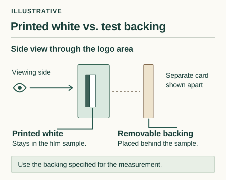
Printed white and a measurement backing can both be behind the green from the viewer’s perspective. Only one travels with the package. Printed white is an ink layer in the design. A measurement backing is the surface placed behind the specimen for a defined reading. Record the white artwork revision with the print job and the measurement backing with the readings. Slide a white card and then a dark card behind the specimen to locate areas where the background shows through. Judge the coverage of a proposed white layer on a sample made with that layer.
If your brand uses instrument readings, agree with the printer on a flat, solid patch large enough for its instrument. Pick a place that avoids the edge of the window, a fold or a photographic pattern. If the logo is too small, ask whether a control patch can be made with the same ink build, film, printed white coverage and finish as the logo. Agree on how the patch represents the logo and which measurement backing to use before taking a reading. Save the reference reading or identified master, the instrument settings, measuring conditions, backing, locations and agreed sampling plan with the job.
A reported Delta E is meaningful when both parties know what went into the comparison. State the color-difference formula, the target and the project tolerance. The CIEDE2000 formula expresses the difference between two color measurements as ΔE00. The purchase agreement supplies the acceptance limit and the action to take if a sample falls outside it. A reading from one solid patch cannot settle whether the food photo has lost detail or whether the reflective band looks right when the pouch is turned. Give those observations their own entries. For the scope of the calculation, see the ISO/CIE definition of CIEDE2000.
Write the outcome so the next person can act on it. “The band is off” tells the printer little. “Compared with the signed band on reference A, the band on B2 looks duller under our agreed light. Photo detail and window position are acceptable. Please confirm the film and white separation used for B2 before sending a revised band sample” identifies the reference, the disputed area and the parts already approved. It leaves the cause open until the printer has checked the job.
What should travel with the next order?
Keep an identified copy of the approved physical sample wherever the next purchase or press decision will be made. Mark the job number and date away from the area to be compared. Agree with the printer on how to store the sample and when to replace a damaged or faded reference. Photographing the label can help staff find the right sample later. Retaining the physical piece gives the next reviewer something to put beside a fresh impression.
Table 3. Brand-color sign-off and reorder record
| Item | What to record | Check before a reorder |
|---|---|---|
| Priority reference and signed master | Record the full target designation, signed sample ID and who holds the reference pieces. | Agree which physical reference controls if the guide and the last approved run differ. |
| Production conditions | Record the SKU and artwork revision, film, white separation, finish and ink set for the approved sample. | Identify which conditions will change on the new order and which areas need another proof. |
| How the color was judged | Record the viewing light and side. If instrument readings are used, record the patch, method, measurement backing, formula and agreed tolerance. | Confirm that the printer can repeat the comparison using the recorded reference and conditions. |
| Release or hold | Identify approved areas, areas to reproof, the approver and date. | Confirm who can release each revised area and which sample will be used as the reference. |
For a reorder with a new matte outer film, send the converter’s print team the previous approved master and flag the material change. Identify the band and food photograph as areas to review through the new face. For an artwork edit that only changes the shape of the window, overlay the old and new white separations and inspect the colored band at their common edge. Such a local change may call for a narrow reproof. A move to a different press and ink set calls for an explanation of how the new run will match the retained reference.
Choose between the two trail mix bids only after you know which samples pass. If the process build meets the color agreement, compare its quoted cost and reorder terms with the spot option. If only the separately mixed green passes, the extra charge buys a result you have actually seen. If neither passes, return the affected area for another trial. When one supplier has shown only a paper proof, mark the film decision pending and price the remaining proof step before awarding the order.
You can adapt this request for either supplier:
Please quote [quantity] pouches using artwork revision [ID]. For the brand band, identify the process simulation and, if your press supports it, price a separately mixed spot ink as an alternative. Use the same proposed film, white coverage and finish. Our priority physical reference is [ID]. Tell us which sample we can use to approve the finished band, what remains to be checked on the first run, and the separate cost of any ink setup or proof.
Frequently asked questions
Does giving a printer a Pantone number mean it will use a separate ink?
The number identifies your target. Ask the estimator to state how the production press will make it. If a dedicated mixed ink is part of the offer, get its setup and proof costs in the quote. If the press simulates the color, ask to see that build on the specified material before you accept it.
Which Pantone suffix should I send for a matte pouch?
Send the full designation in the approved brand reference. C and U in the Pantone graphics system refer to coated and uncoated guide paper. Specify the pouch’s matte surface separately and ask to review the band through that surface. Changing the suffix to suit the word “matte” would give the printer a different reference.
Can my food photograph use CMYK while the logo uses a spot ink?
Yes, if the production press and quoted ink configuration support both. Have the printer identify the logo separation, the process image and any white layer. State whether you need a solid-ink drawdown for the logo, a proof of the photograph, or a finished sample that lets you review both together.
Can I approve a brand color from a PDF or a photo of the proof?
An ordinary PDF or phone photo is useful for identifying an area or approving a layout revision. For a physical packaging color, compare the agreed reference with a representative printed sample. If you and the printer operate a controlled soft-proofing workflow, document which decisions that particular workflow can support.
What Delta E tolerance should go on my pouch specification?
Ask the brand’s color owner and the printer to agree on a limit for the particular solid, reference, method and material. Record the formula and the action for an out-of-tolerance sample. If nobody has agreed on a measurable range, keep that field open until the parties settle it before production.
Do I need a new proof if only the film or finish changes?
Ask for a sample showing how the affected colors look with the new construction. Bring the previous signed pouch to the review and identify the areas that must match it. If you accept the new version, label it with the changed specification and retain both references so the next order can call up the correct one.