
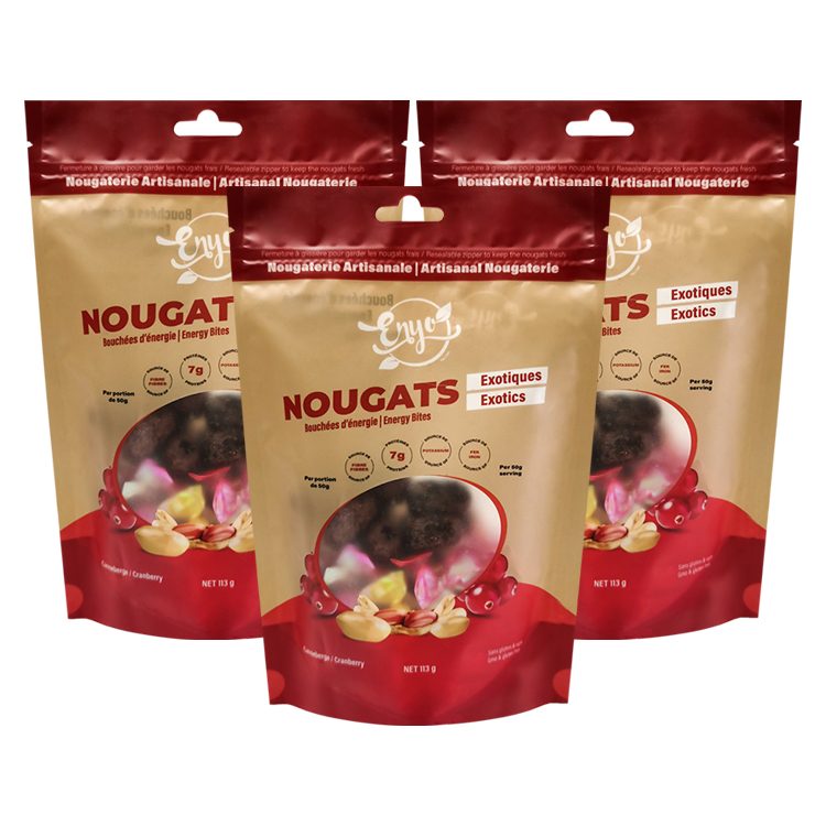
To print on candy bags, agree the bag construction and printing route with a packaging supplier, obtain its current dieline, and prepare artwork for that exact layout. Define the colors, white ink, windows, and finish separately. Review proofs for their stated purpose, approve each product version, and release an identified production file. A picture of a finished bag is a design reference, not a complete printing instruction.
For a candy brand, most preventable printing problems begin before anything reaches the press. The strawberry front might be paired with the lemon ingredient panel. A clear window might disappear behind white ink. A small change to the pouch opening might move the artwork into an area removed when the consumer tears the bag open.
This guide explains commercial artwork preparation for custom candy packaging. It is not a tutorial for printing party-favor bags at home. References were checked in September 2026; US labeling sources are used only where noted. Exact file settings, clearances, and acceptance requirements must come from the supplier handling the actual job.
Decide what you want the printer to supply
“Printing a candy bag” can describe three different purchases: printed material that will be converted into pouches, decoration applied to an existing compatible bag, or separate labels attached to stock packaging. Those routes have different file, material, and application requirements. Confirm the deliverable before paying for finished artwork.
For a custom converted pouch, ask whether you will receive empty finished bags or printed rollstock for your own packing equipment. Both can carry a design, but they are not interchangeable deliveries. If you need individual candy wrappers as well as an outer bag, identify them as separate items in the brief.
An existing pouch should not be fed into a desktop printer simply because its surface feels like paper. Its thickness, folds, coating, and intended food use need to be compatible with the proposed process. Likewise, a sticker project needs its own checks for label placement, adhesion, and information visibility.
For factory-produced custom printed candy bags, describe the finished pack and its use first. Include the candy type, intended portion, bag format, filling method, number of designs, and markets. Tell the supplier which decisions are settled and which still need sample review.
A useful early deliverable is a brief that a designer and a packaging technician can both understand. It should connect the product name and artwork version to an actual bag specification. This connection matters more than whether the first presentation uses an elaborate mockup or a simple drawing.
Build the brief around the complete candy range
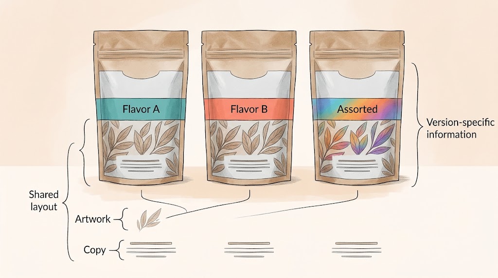
List every version before you design the first front panel. A flavor change can also change the ingredients, allergen information, product photograph, barcode, or net quantity. A language edition may require substantially more space even when the brand graphics stay the same.
Separate shared elements from product-specific elements. The brand mark and general layout may stay consistent; the flavor name and approved information panel need independent review. Do not assume that changing the background color completes the work for a new candy variety.
For an assorted pack, decide whether the artwork represents a fixed mixture or a product whose contents can vary. Give the designer approved product information rather than asking them to infer it from a handful of samples. If product photography is used, identify the image that belongs to each version.
Also record how the pouch will be displayed. A hanging bag needs its key information to work around the hanging area. A stand-up pouch should be reviewed both flat and filled. An online thumbnail can help assess recognition, but it cannot confirm whether small printed information is legible on the physical package.
Before artwork begins, name one person who will consolidate feedback. The designer should not have to choose between a salesperson's annotated screenshot and a later message from production. Resolve those comments into one revision request with the affected product versions clearly identified.
Use the supplier's dieline as the layout authority
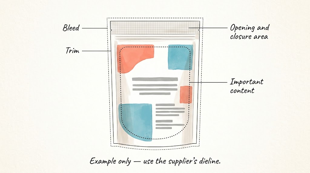
A dieline maps the artwork to the intended finished package. Obtain the current drawing for the agreed dimensions and construction, including its revision reference. A template downloaded for a similar-looking pouch may place the folds, sealing areas, or opening features differently.
Ask which way the drawing is viewed and how the panels become the finished bag. Identify the front, back, gusset, seams, and top opening before adding graphics. If the print is viewed through a transparent outer film, leave production mirroring or imposition to the printer unless its instructions explicitly assign that work to you.
Keep the technical drawing separate from printable artwork in the form the supplier requests. A bright outline can be useful during design review, but it must not accidentally become a printed border. Ask how technical layers should be named and handled in the submitted and approved files.
Distinguish trim, bleed, and content clearance
Bleed extends artwork beyond the intended cut boundary so a small cutting variation does not leave an unintended unprinted edge. It does not increase the finished bag dimensions. Adobe explains the principle and directs users to their print provider for the job's required allowance. Adobe guidance on marks and bleed.
The clearance for important content is a different issue. Text can sit inside the cut boundary yet still be too close to a seam, fold, zipper, or tear path. Follow the supplier's stated clearances for those features rather than using one generic margin for the entire design.
Avoid putting essential product identification solely on the removable top strip. Consider how the pouch will look after the first opening, especially when consumers will keep using it. A bag can look well balanced before opening and lose useful information when the top is removed.
If the dimensions change, request the revised dieline and check the complete layout again. Scaling the finished design proportionally may shrink type, change a barcode, or alter the window relationship. A larger pouch is not necessarily the same design enlarged by one percentage.
Plan clear windows and white ink together
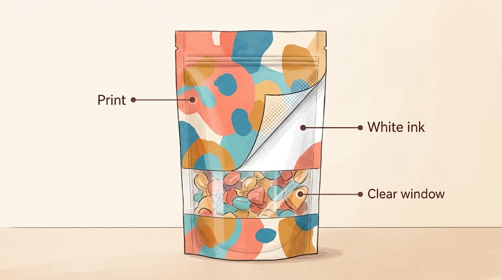
A transparent window is a material and printing decision, not merely a pale shape in a design file. Confirm whether the proposed construction can provide the desired clear area. An opaque layer can prevent transparency even when the artwork itself contains an unprinted region.
Where the structure supports a window, identify that area explicitly. Ask how the printer wants the window shape supplied and how it will interact with color, white ink, and finishing layers. A white rectangle on a screen does not tell the printer whether you mean a clear opening, an opaque white panel, or simply the document background.
White ink may be used behind selected graphics on transparent or metallic-looking substrates to change their appearance. The printer needs a defined coverage plan. Do not assume that every colored object needs the same white backing, or that the printer can infer a shaped window from a low-resolution mockup.
HP's Indigo documentation lists white inks separately from its standard process colors. This illustrates why a production discussion may include more than CMYK; it does not establish which inks, opacity, or press configuration will be used for your order. HP Indigo flexible-packaging press documentation.
Check the proposed window with the actual candy behind it. The visible product becomes part of the composition: its color, size, and wrapper pattern can affect how nearby printing reads. A rendering with evenly arranged sweets may hide the way a normal filled pack actually looks.
For a narrow printed border around a window, ask about the relevant alignment allowance. Do not place two boundaries so precisely together that the design depends on perfect alignment. The supplier should explain an achievable treatment rather than promise that registration variation never occurs.
Treat white objects and spot white as different file questions
Ordinary white objects in a design file are not automatically a defined white-ink separation. Adobe also distinguishes unintended white overprint from spot-white behavior. Ask the prepress team to confirm the required spot-color name and overprint treatment; do not turn overprint on or off globally as a shortcut. Adobe white-overprint guidance.
Have the printer show the proposed color artwork, white coverage, and intended clear area together during review. Check that removing the white backing from a window has not accidentally removed a nearby white logo or information panel. These are easier questions to answer before the file is released.
Prepare files that can survive the handoff
Ask for the supplier's artwork specification before exporting. It should identify accepted file types, document scale, image requirements, color handling, font treatment, technical-layer conventions, and PDF settings. A file extension alone does not prove that the content is suitable for production.
Keep a working master that remains editable. If the printer requests outlined text, create the required production version without discarding the live-text source used for future corrections. Review the outlined or exported result because a correct editable document does not excuse an incorrect final output.
Check images at their placed size. Enlarging a small picture can reveal poor detail even if the file looked sharp as a thumbnail. Ask the printer for its effective-resolution requirement for the intended process, and obtain the original artwork instead of enlarging screenshots from a website.
Adobe's packaging feature can gather an Illustrator document, linked graphics, applicable fonts, and a report. Font licensing still needs attention, and a packaged folder is not an automatic prepress approval. Use it as a way to organize assets when that matches the printer's workflow. Adobe file-packaging documentation.
Export the production PDF using the agreed preset or specification. Do not add unfamiliar crop marks, flatten everything, or convert all spot colors merely because a generic online checklist says to do so. Those changes can affect technical separations that the packaging printer expects to retain.
Open the exported PDF as a separate review step. Check page dimensions, missing elements, unexpected changes to small text, and whether the technical information is presented as requested. Send the printer a clean, identified submission rather than a folder containing several equally plausible final files.
Agree color and finish expectations before approving a proof
A screen shows emitted light; a printed pouch is viewed through reflected light and may include transparent, metallic, matte, or glossy areas. An attractive monitor view cannot by itself define a production color target. Decide which reference will govern the color discussion and what kind of proof the supplier can provide.
For an important brand color, name the intended reference and ask how it will be reproduced on the selected material. A spot-color name, process-color build, physical sample, and photograph are different forms of instruction. Resolve conflicts between them instead of expecting the printer to guess which one wins.
Adobe describes overprint as a setting that changes how overlapping colors interact and recommends previewing the result. Use this to flag potential file problems with the printer, especially where fine details sit on colored areas. The preview is an approximation, not a promise of the finished pouch's appearance. Adobe overprint guidance.
Acrobat Output Preview can inspect separations, source color spaces, and certain output conditions. It is useful for finding an unexpected RGB object or checking whether a spot separation remains present. It does not replace agreement on the physical proof and production process. Adobe Output Preview.
Specify finishes separately from the illustration that suggests them. A shiny highlight drawn in a rendering is not an instruction for a glossy varnish; a gold-colored shape is not necessarily foil stamping. If a finish needs a separate file or separation, identify it explicitly and review its placement on the formed pouch.
Compare digital and gravure using the same job brief
Digital and gravure are production choices to evaluate after the quantity, material, design count, and approval needs are understood. Digital printing works from digital job data without the engraved image cylinders used in gravure. That distinction does not eliminate prepress, material preparation, conversion, or quality checks.
A brand launching several candy flavors should provide quantities for each design, not only a combined total. Also indicate which elements change between versions and how often updates are likely. A seasonal pack with frequent copy changes creates a different quoting discussion from a stable design ordered repeatedly.
Mylarbag describes both digital printing and gravure printing options. Ask for a project-specific comparison using the same pouch specification and quantities. Confirm setup charges, proofing, version changes, and repeat-order conditions in the quotation rather than applying a universal break-even quantity.
Ask what happens if one flavor's artwork changes after approval. The consequences may depend on which printing elements change and how the job is organized. Obtain the answer before releasing a mixed-design order, especially when the commercial team expects last-minute flexibility.
If you change printing methods between orders, revisit the color and sample agreement. An earlier bag remains a useful reference, but the new route may need its own proof review. Do not make a previous approval apply automatically to an altered process or material.
Name what each proof or sample is supposed to prove
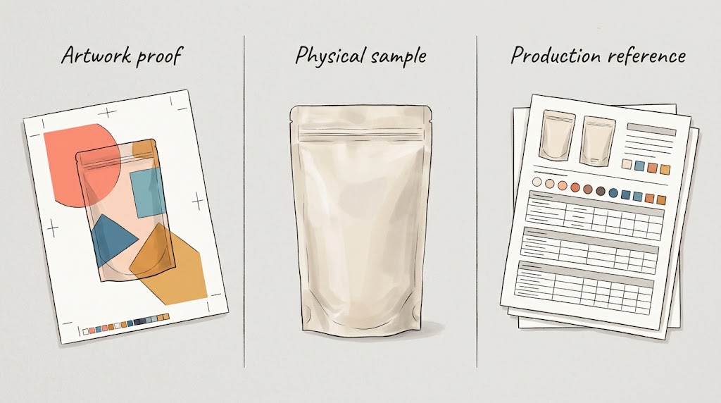
The word proof is often used loosely. A PDF can confirm text and layout; a material sample can help assess feel; a formed sample can show panel placement. None automatically answers every question about printing, construction, and product use.
Ask what differs between the review item and the proposed production pack. Differences might include the substrate, printing process, finish, adhesive construction, or forming method. Record those differences beside the approval so the team knows which questions remain open.
Review the complete pack, including the back and base. Check whether a sentence continues into a fold, a window competes with required information, or a tear opening removes something the buyer will need later. Use the intended fill where it helps reveal distortion or hidden areas.
Make approvals specific. “Layout approved; physical color review pending” communicates more than “looks good.” If the supplier does not offer a particular proof type, agree how the corresponding risk will be addressed before treating the order as fully approved.
Keep product information and codes under separate review
The designer needs approved text, not responsibility for inventing ingredients or nutrition information. Supply the relevant information for the actual recipe, portion, and market. When one flavor changes, check every associated panel rather than carrying the previous flavor's details forward by default.
For US sales, use current FDA labeling resources and appropriate review for the product. FDA's Food Labeling Guide page specifically flags older allergen and nutrition sections that need newer references; an old downloaded guide should not become the sole authority for new artwork. FDA Food Labeling Guide and update notes.
Have the responsible reviewer confirm claims before they are designed into prominent graphics. Terms about ingredients, nutrition, allergens, or environmental attributes need a basis appropriate to the product and market. A printer's acceptance of a file is not approval of the claim's meaning.
Treat barcode artwork and encoded product identity as controlled assets. Ask the relevant barcode provider and receiving retailer about the requirements for the intended use, including appropriate verification. Do not resize a supplied symbol arbitrarily to make an awkward space work, or assume a successful phone scan settles print quality.
Reserve the required clear area for any code and confirm its position on the finished pouch. Folds, seams, reflective areas, and variable product visibility can complicate the chosen placement. Avoid assigning universal barcode dimensions here: the symbol, application, printing conditions, and requirements need to be identified first.
If dates or lot information will be applied after pouch manufacture, identify that coding area in the artwork brief. Confirm it with the filling team and the equipment supplier. Decorative graphics should not occupy space the packer needs for readable variable information.
Control multiple flavors with one release list
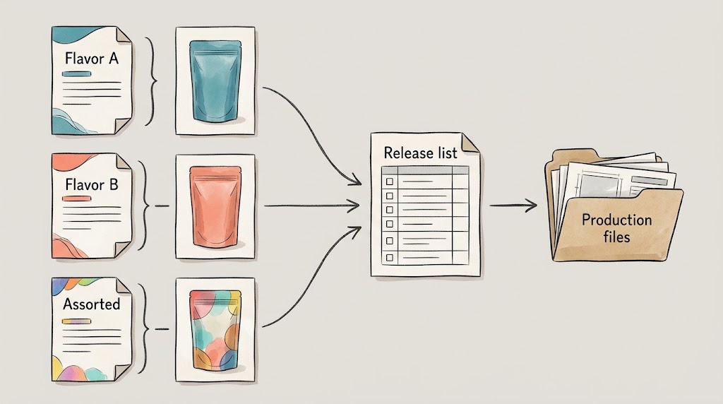
Use a simple release list linking each candy version to its approved artwork and quantity. The example below is a planning format, not a customer order or a claim about the information any particular candy requires.
Give files names that remain understandable outside the designer's computer. A name can include the product, market, bag-size reference, and revision. Keep the approved dieline reference in the release list as well. “Final-new-final” does not help a production coordinator distinguish an approved version from a later experiment.
Review the flavor family side by side, then review each back panel individually. The first pass catches inconsistent brand treatment; the second catches copied information that looks plausible in a familiar layout. Keep approval status separate from visual similarity.
When a change arrives after approval, state exactly what is changing and which versions are affected. Ask the supplier to confirm the current production status before treating the edit as available for that order. A corrected PDF in your folder does not prove the factory received or accepted it.
Related project: a printed nougat pouch with a shaped window
The published nougat and energy-bite pouch project provides a concrete combination to review: a shaped display window and hanging feature in a matte stand-up format. The record specifies digital printing and MATOPP/PET/PE for the Canadian project, with the size written as 14 × 21 + 4 cm.
The front-and-back photograph provides a useful design-review reference: the product display area, printed graphics, top features, and back-panel information share limited space. It does not reveal the original white separation, color target, approval process, or the performance of the finished package.
<!-- FIGURE 6: Verified real nougat project front-and-back photo. -->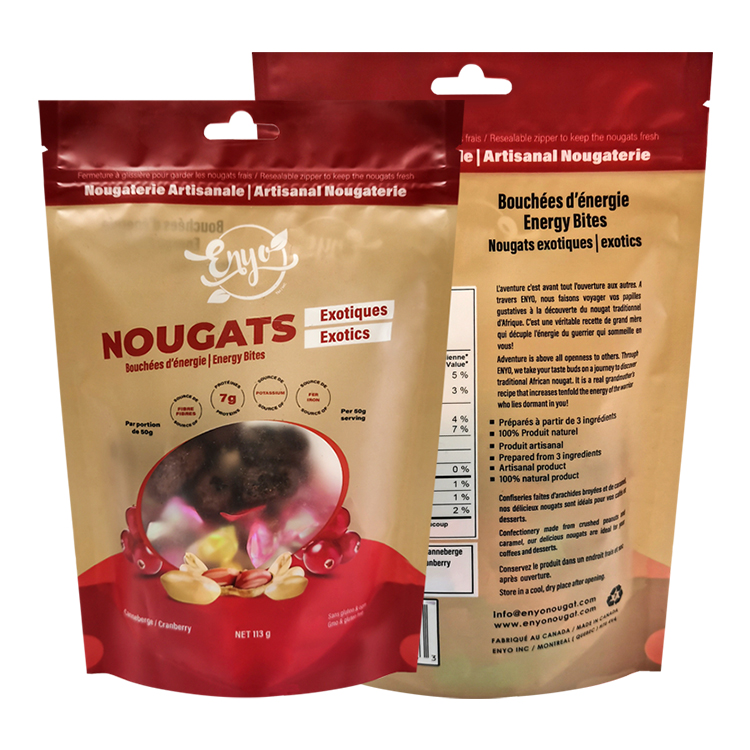
For a new design, ask for its own dieline and window instructions. Do not trace this customer's graphics or copy its product statements. The useful lesson is to review the visible design and the technical specification together, with separate approval for your own candy and market.
Recommended packaging configuration
For a retail candy range, evaluate a stand-up or flat pouch with the portion, opening, product-information space, and intended display agreed before detailed artwork. If a clear window is important, confirm the construction and white-ink plan early. Keep finishes subordinate to readable information and a usable package.
Use Mylarbag's candy packaging design and printing options to discuss that brief. Request the current dieline, artwork requirements, suitable samples, and a quote identifying the print route and each design quantity. This gives the designer a defined project rather than a generic bag silhouette.
Frequently asked questions
How do I make custom candy bags for my brand?
Start with the product, portion, bag format, markets, and number of designs. Obtain the supplier's dieline, prepare artwork to its requirements, review the appropriate proofs and samples, and approve an identified version. Commercial food packaging involves more than personalizing a printable party-favor template.
Can I print directly onto blank candy bags?
Only if the bag and printing process are suitable for that purpose. Confirm the substrate, coating, thickness, feed requirements, and intended use with the providers. For a factory-converted custom pouch, the agreed route may instead print material before it becomes a finished bag.
What file should I send to print candy packaging?
Send the format requested by the printer, with the correct dieline revision, images, fonts or agreed font treatment, and required color separations. A review PDF is useful, but the supplier may also need editable artwork. A flattened screenshot usually leaves important production questions unanswered.
Do clear candy bags need white ink?
Some designs use white ink behind selected graphics; others intentionally leave areas transparent. The decision depends on the construction and desired appearance. Define the white coverage and window separately with the printer rather than assuming a white shape in the design file specifies both.
Is digital printing always the cheapest option?
No. Compare quotations for the same material, pouch, quantities per design, finish, and approval requirements. Setup, revisions, repeat orders, and converting work also affect the comparison. There is no single quantity at which every candy project should switch printing methods.
Does approving a PDF approve the finished bag's color?
Only to the extent explicitly agreed for that proof. A PDF is useful for copy and layout review, but physical material and printing conditions affect appearance. Identify the color reference, proofing conditions, and remaining approvals before giving production authorization.
Release a clear instruction, not a folder of possibilities
Before release, check that the purchase brief, dieline, artwork, proof, and design quantities all describe the same order. Identify any outstanding questions and resolve them with the responsible person. Keep the approved files and correspondence together so a repeat order starts from a known version.
Send Mylarbag your candy packaging artwork brief with the product type, portion, market, bag direction, design count, and available artwork. Ask which file requirements and proofing steps apply before completing the production files. That makes the next review about specific choices the factory can assess.