

Matte usually softens reflections. Gloss gives a sharper highlight as you tilt the pouch. To choose between them, have the supplier print your own design in both finishes. Fill the samples to the same shape, stand them under the lights where you sell the product, and try to read the smallest flavor name. Tilt the bags together and see whether that word stays readable on each.
What changes when you tilt a matte or glossy food pouch?
Suppose you sell sea salt and sea salt & vinegar chips in similar dark bags. A shopper looking down at the shelf needs to catch the words “& vinegar” to pick the right one. Circle “vinegar” on the artwork before ordering the two finishes. A single pair will tell you whether the word stays readable. To test whether a shopper can tell the two varieties apart, request both finishes for each flavor, four samples in all. If both samples hide those words, you have a reason to move or enlarge the type on the next proof. If one keeps them legible, carry that sample forward for color and handling checks.
A glossy surface can reflect a fairly distinct image of an overhead light. As the bag turns in your hand, that image may travel from an empty part of the panel across the name. A matte surface scatters more of the light over a range of directions, so the reflection tends to have a softer edge. Look at an actual filled bag. A crease can angle one small patch toward a light even when the rest of the panel looks subdued. The Rochester Institute of Technology illustrates this distinction in its guide to surface gloss on prints.
Look at the faces of the three bags in our glossy flat-bottom coffee pouch project. Each has a colored band at the top and a variety name farther down on the dark panel. Try covering the blue band in the photograph and finding the decaf bag again. That small exercise tells a designer which second clue a shopper has available when a hand covers part of the pack.

A different design on our matte coffee pouch puts a few words in large yellow type above several lines of much smaller white lettering. On a sample with this layout, read the first line of white text before judging the panel by the yellow headline. The headline can be easy to find even when the letters immediately below it take effort to separate.

The project pages identify the exterior finishes. The two photographs show different artwork, under lighting we cannot match between the two shots. Use them to decide what to circle on your proof. For a food photograph, that might be the boundary between a dark piece of chocolate and its dark background. For a back label, it might be the line that gives the mixing quantity. Note who needs to see each detail and where they will be holding the pack when they read it.
Ask for two samples printed from the same artwork
Send the converter one dated production file and a marked copy showing the text or image you want to compare. Ask for two finished samples from that revision. A proof printed on white paper can help you spot a typo. To see the effect of the finish, you need the artwork on the proposed film, including the backing behind the printed areas. On clear or metallized stock, a change to where white ink sits under the design can change the appearance of a color before either surface finish goes on.
| What to match | Sample A · matte | Sample B · gloss | Who confirms it |
|---|---|---|---|
| Artwork and type | Dated file for the SKU | Same revision and flavor text as A | Designer marks the reading area for each SKU |
| Printed construction | Identify base film, inks and print process | Use the same specifications or list each change | Printer returns both specifications |
| White ink | Mark coverage beneath the selected detail | Match the white artwork layer | Prepress checks the two separations |
| Exterior | Name the matte film or applied coating | Name the gloss film or applied coating | Converter identifies the exposed surface |
| Label or window | Mark its position and coverage | Use the same label or window layout | Designer supplies the placement drawing |
| Converted shape | Record pouch size and intended fill | Match the dimensions and fill | Packer identifies both samples |
Write the actual treatment next to each sample number. A specification for matte varnish calls for a coating. A supplier offering gloss lamination is proposing a film layer. If the converter must change the outer film or printing process to make one version, you can still decide which finished bag to buy. Keep the changed fields on the quote so the printer knows which construction to reproduce.
If only a small part of the design has a glossy overprint, put its outline on the marked proof. For example, a gloss spot that ends at the edge of a fruit illustration leaves the flavor name on a different surface. Ask the supplier whether the two trial versions will keep that spot. Otherwise you may end up comparing one fully glossy bag with another that has gloss on the illustration alone.
If the supplier offers “soft-touch matte,” ask for a separate swatch to handle before paying for a third print run. Our EcoCoffeeBag gallery of coffee bag finishes shows a soft-touch project alongside ordinary matte and glossy examples and identifies the films used. Handle a stock swatch to decide whether the soft-touch texture deserves its own printed trial. For the words and colors on your own pack, use the marked artwork when you write to the supplier.
Please print the attached artwork in matte and gloss, identify the outer finish on each sample and list any other differences. Use the same white ink coverage and pouch dimensions where possible. We will compare the marked flavor name under our shelf lights and check the brand color against our approved print sample.
Read the small print under the lights where the pouch will be sold
Take both samples to the shelf with the retail tray you intend to use. Fill them to the intended weight with the same product, close them the same way and settle each base. Put them where the first two saleable units would stand, with the flavor name facing the aisle. A lamp beside a desk can help you locate a highlight. For the buying decision, you want to know whether that highlight passes over a word while a customer is choosing a bag.
Choose a reader who hasn't worked on the artwork. With one SKU in two finishes, show each sample in turn at the usual shopping distance. Ask the reader to read the flavor name aloud and note whether they had to pick up the pack. For a choice between two flavors, put out the two matte flavors together, then the two glossy flavors. Ask the reader to find the same flavor each time. Reverse the order for a second reader and vary which side holds the requested flavor. If the retailer wants the selection timed, agree when to stop the clock. Someone who remembers where the right bag stood can pick it up without reading a word.
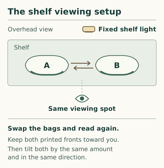
For the same-SKU comparison, mark the left and right shelf positions with removable tabs. Keep the light and the reader in place. Read the front with the bags facing forward, turn each by the same amount, then exchange their positions and repeat. The distinction matters on a shelf with a spotlight at one end. If the difficult word becomes clear whenever either bag moves to the right, try the display in its proposed position before requesting another finish. If the same sample stays troublesome in both positions, mark the word and the viewing angle on its proof for the converter.
If both packs hide the same syllable, have the designer move the variety name into the part of the face that stayed visible, or enlarge the type. Repeat with the revised lettering at its actual printed size. For a seasonal product that gets a flavor sticker after filling, take the production label to the trial. Read one line printed on the pouch and one on the sticker during the same turn. When only the sticker catches the lamp, ask the label supplier for a sample of the alternative label stock before you change the film across the entire range.
Shelf comparison checklist. For one SKU in both finishes, record the store or fixture, shelf height, light source, viewing distance, artwork revision and both sample IDs. Repeat each check for samples A and B, and note the words that are legible or hidden by reflections.
| What to check | How to compare samples A and B | What to record or do next |
|---|---|---|
| Front-facing reading | Place both bags facing the aisle at the usual shopping distance. Ask a reader to read the same variety name on each. | Record the words read or missed for each sample. Note the time only if timing was agreed. |
| Tilt toward the light | Turn both bags by the same amount and in the same direction, then read the same line. | Mark any word crossed by a highlight on each sample. |
| Swap shelf positions | Exchange A and B, keep the reader and light in place, and repeat the turn. | Note whether the difficulty follows the sample or the shelf position. |
| Read near obstructions | Pick up each pouch and read a line near a fold, valve or applied label. | Identify the affected line and surface. Mark the crease or label position for the next review. |
The close view of the glossy coffee pouch below shows a pale logo and small lettering beneath a round valve. Look at the contours of the dark panel around that lettering. On your own filled bag, check whether a line crosses a crease and whether bringing the bag closer helps. If a price sticker covers the line, move the sticker and repeat. A finish change elsewhere on the panel would leave that obstruction in place.

Check brand color and handling marks separately
Bring the physical color reference that the printer and the brand approved. Write its revision on the color review sheet. Compare the same printed patch on each sample beside that reference under the viewing conditions agreed with the printer. A broad, flat area is easier to compare than a narrow letter running over a fold. In a dark design, also check the border where two nearby colors meet. A shift there can make two flavors harder to distinguish even when both logos remain easy to read.
Use the agreed viewing setup to decide whether the printed color matches the reference. Take the samples back to the retail light to decide whether both varieties can be recognized there. Record the decisions separately. If a patch looks different on the shelf, give the printer the physical sample and indicate the patch, the lighting and the angle. Before requesting an ink adjustment, confirm the white backing and outer film on that sample. For print buyers and printers agreeing how to view prints and physical references, ISO 3664 covers viewing conditions.
A supplier may offer a gloss reading to help identify the finish for a repeat order. Ask which face and area of film were measured, at what angle and by which procedure. Compare results from comparable specimens using the same procedure. For example, a value for clear window film and one for an opaque printed panel belong on separate lines of the specification. Use the shelf observations to decide whether the lettering can be read. ASTM D2457 describes gloss measurements on plastics.
For a handling check, start with clean, dry hands and keep one area of each sample untouched. Grip each pouch as a shopper would to read the back. Set it down and look again under the same lamp. Record how the film felt in the hand, then locate any visible mark on the panel. If the converter recommends a particular cleaning method, try it on a spare sample and record whether the mark lifts. A fingerprint that disappears and a line that remains after wiping give the supplier different problems to investigate.
If the concern is rubbing during shipment, keep an unused printed specimen and identify the material that actually touches the face inside the carton. Give the supplier the proposed pack arrangement and agree on what damage would be unacceptable, such as loss of a letter in the flavor name. Ask for the tested print and coating, the rubbing surface, test conditions and observed change. ASTM D5264 addresses abrasion resistance of printed materials using a rub tester on suitable flat printed specimens. If damage appears only at the folded corner of a filled pouch, send that pouch and its carton for a separate packing trial.
Keep the sample that production needs to match
Once you have a preferred finish, identify what the next print run must reproduce. Mark the sample number on a tag attached to the top seal, leaving the printed panels free for inspection. Record the finish by the supplier’s film or coating reference as well as its everyday name. A buyer reordering six months later should be able to put the tagged pouch beside the purchase order and find the same reference on both.
Give separate approval to areas with different jobs. On our pink chocolate melts pouch, a horizontal window sits below the dark rectangle carrying the product name. The project specification also identifies spot UV. On a drawing for a similar bag, outline the area through which the shopper should see the product, then use the finish artwork to locate the area that should catch the light. The photograph can help a designer locate the window. The separate spot-finish layer gives the printer the shape and position of the area to coat.

Suppose two chocolate varieties differ mainly in the size of their pieces. The buyer wants shoppers to see that difference through the front window. Fill both test bags to the intended level, stand them in the display tray and look through the portion of the window visible above the tray lip. If the cardboard hides most of the opening on both bags, mark its upper edge on an artwork proof. That gives the designer a reason to try a higher window before ordering another finish sample.
Send the converter the evidence they need to reproduce a handling concern. If the packer found a line after unpacking the case, tag the pouch and its clean reference with their sample IDs. On a separate sketch, circle the area and mark where it touched the carton or another bag. In the observation space, write when the line first appeared and what the packer did next. Keep the shipping case if the mark lines up with a divider. The converter can then inspect the same part of the sample before proposing a different finish.
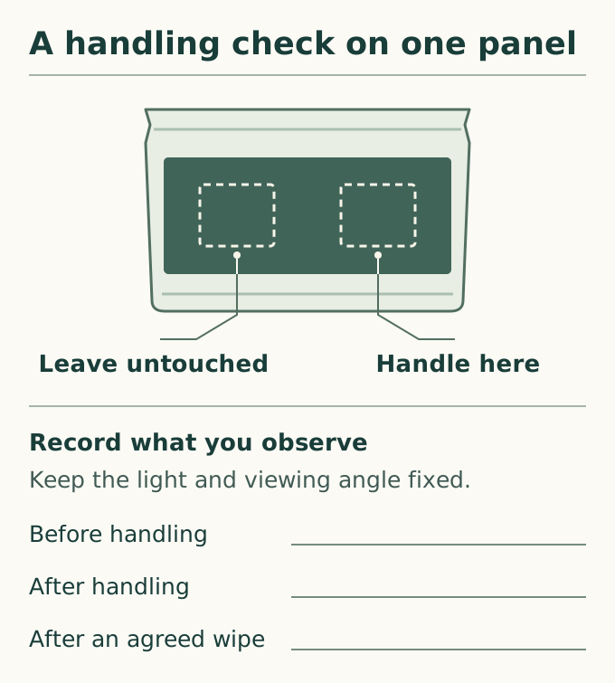
Sample approval checklist. Use one SKU and one artwork revision for each review. Record the sample ID, approval date and person responsible, and note any work still due.
| What to approve | What to check | What to record or do next |
|---|---|---|
| Flavor name or smallest critical text | Check the exact words, panel, shelf position and viewing direction on the selected sample. | Identify the sample and any words to move or enlarge. |
| Brand color | Compare the sample with the approved physical color reference under the agreed viewing conditions. | Record the decision or mark the area that needs correction. |
| Window, label or spot finish | Check each position on the drawing and the corresponding artwork revision; inspect the filled pouch. | Record the approval status and any area still requiring review. |
| Touch and handling | Check the finish reference, the area handled and the untouched comparison area. | Describe any visible mark and whether it remained after the agreed check. |
| Abrasion requirement, if specified | Review the test record for the selected printed surface against the agreed acceptance criterion. | Attach the relevant report or assign the open item to its owner. |
| Production release | Check the selected sample ID, outer film or coating, and the sample retained by each party. | Record the approval scope, open items, decision owner and date. |
When a reviewer approves a sample by phone, send back the sample ID and a short description of the decision while both teams have the proofs in hand. A designer might approve the red panel of one flavor while asking for larger lettering on another. Give the second flavor its own entry so the printer can tell which file is ready.
If both samples pass, have the supplier quote the same completed order in each finish. Match the quantities per flavor, print process, bag specification, delivery terms and any one-time setup charges. Ask which costs will recur on a repeat order. A lower unit price on a larger run tells you little about the cost of the finish on the quantity you actually need.
For a sample request, send the artwork revision, the two finish choices and a photo showing the intended display. Point out the words a shopper needs to read. Request printed food pouch samples.
Frequently asked questions
Is matte always easier to read under store lights?
Small type can be hard to read on either finish. Choose the one requirement that matters at the shelf, such as distinguishing salted from unsalted. If both filled samples obscure the word at the normal viewing distance, revise its size, contrast or position and try the new artwork on a sample.
Why does the same brand color look different on matte and gloss?
The finishes reflect the viewing light differently. Check that both samples use the agreed base film and white ink behind the color. Then compare each one with your approved physical reference under the same viewing conditions before asking the printer to change the ink.
Can I approve the finish from a PDF or a supplier’s photo?
You can approve the intended position of a gloss accent on the artwork PDF, then check its alignment on the printed sample. A supplier’s photo can identify which sample to send. For final approval of the surface, ask for a printed sample you can tilt and handle.
Which finish shows fingerprints or scuffs more easily?
Check the printed area where a hand normally grips your pouch. Compare it with an untouched area on the same sample and repeat on the other finish. A mark that wipes away and a line that remains deserve separate entries on the sample record.
Can a matte pouch have a clear window or a glossy label?
Yes, if the selected construction supports it. Have the supplier mark the window, white ink, applied label and coating boundaries on the drawing. Check the label text on the actual label and inspect the window with the food inside.
What should the supplier keep after I approve a finish?
Keep a matching physical sample on each side, with the artwork revision and agreed finish reference. If a later order changes the outer film, coating or white backing, use the retained pouch to agree which areas need a fresh proof before production.