
Good tea packaging design makes the product easy to recognize, choose, handle, and understand. It is not simply artwork placed on a pouch. The design has to work with the tea’s format, the physical pack, the sales channel, the required information, the print process, and the consumer’s use after purchase.
Start with a clear packaging brief and finish with a full-size proof and filled sample. The process below covers loose leaf tea, tea bags, individual envelopes, cartons, and flexible pouches. It does not promise a particular material, print finish, shelf-life result, food-contact status, or environmental outcome; those decisions require a final project specification and supporting evidence.
Begin with the product decision, not a mood board
A mood board can help a team discuss tone, but it cannot answer the most important packaging questions. Before a designer begins, define what the buyer is actually receiving and how they will use it.
Write down:
- whether the product is loose leaf tea, a filter bag, an individually wrapped unit, a multipack, a refill, or a gift set;
- the target net quantity or pack count;
- the main sales channel, such as specialty retail, hospitality, online, subscription, or foodservice;
- the customer’s first decision at shelf or on a product page;
- the information that must be visible on the final pack for the intended market;
- whether the pack needs a closure, code area, window, carton, or other functional component;
- the actual pouch or carton format being evaluated;
- who has authority to approve copy, artwork, product facts, and market requirements.
This brief distinguishes a visual preference from a non-negotiable packaging need. For example, a botanical illustration might be an aesthetic choice; a defined count of individually handled tea bags may be a functional requirement. Both influence the final design, but they should not be treated as the same type of decision.
Define a single front-of-pack message
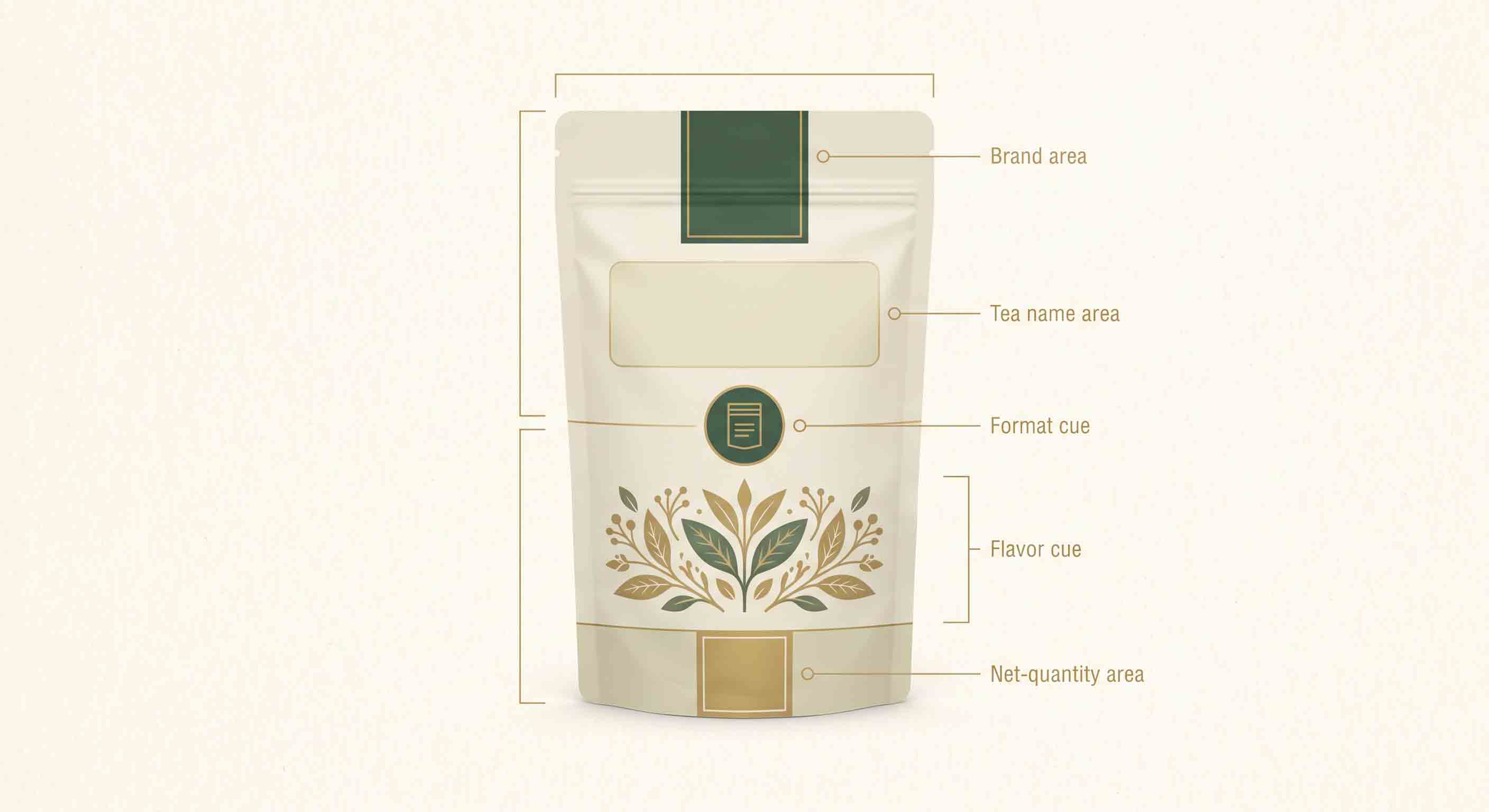
Tea packs often try to carry every product story on the front. That creates an unclear hierarchy. Start by deciding what a shopper should understand in a few seconds. For many tea products, that is a sequence like brand, tea name, tea format, flavor or blend cue, and net quantity or count where required.
The exact order depends on the brand and market, but the principle is stable: a customer should not have to decode the product type from decoration alone. A design that makes a loose leaf tea look like a single-serve bag, or makes an herbal blend indistinguishable from a conventional tea, can create confusion even if the graphics are attractive.
Use a simple hierarchy test:
- View the artwork at its actual front-panel size, not zoomed in on a screen.
- Stand far enough away that small copy is not readable.
- Ask what is still clear: brand, product name, flavor or type, and format.
- Compare the result with adjacent products in the range.
- Adjust contrast, type scale, and information order before adding more decoration.
This is a readability exercise, not a claim that a particular visual treatment will increase conversion or retail performance.
Design the complete system, not only the hero panel
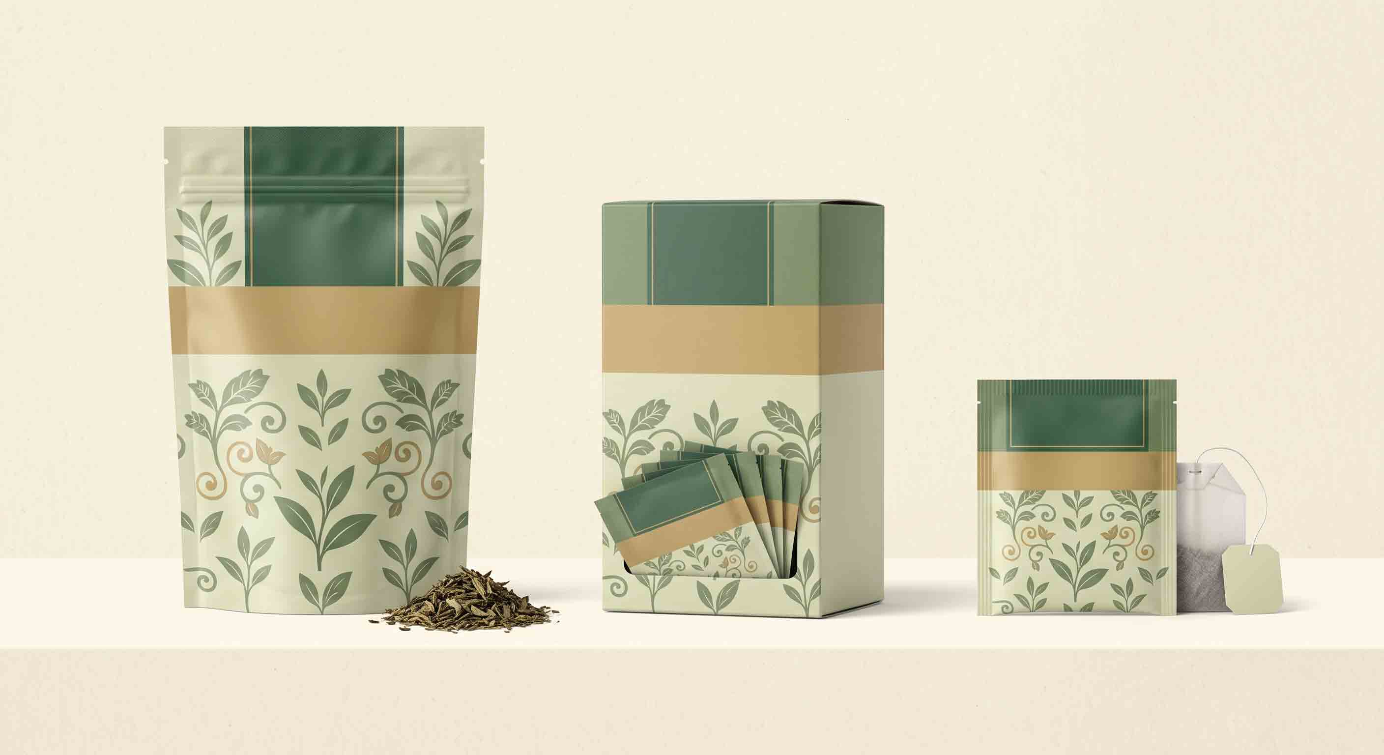
The pack consumers hold may include more than one layer. A loose-leaf pouch can sit in a carton. A filter bag can sit inside an individual envelope, which then sits in a counted carton. A gift set can use a sleeve, divider, and outer box. If only the main front panel is designed at the beginning, the rest of the system may later become inconsistent or overcrowded.
Map each layer and its job:
Do not assume a statement printed on one layer can safely be omitted from another. The responsible brand owner should confirm what must appear on each final unit for the destination market.
Build a tea range that can grow
Many tea brands introduce more flavors, origins, caffeine options, or seasonal blends over time. A design system helps the range stay recognizable while leaving room for product differences. Common system elements can include a consistent brand mark position, repeated information zones, a controlled color system, a shared type scale, a recurring illustration approach, and a clear format cue.
Avoid using color alone to distinguish variants. Small thumbnails, grayscale printouts, color-vision differences, and retail lighting can make similar colors hard to tell apart. Pair color with plainly written names, a distinguishable symbol or illustration system, and consistent front-of-pack placement.
For a range with both tea bags and loose leaf tea, make the format visibly clear. The two products may share a brand system while using different pack shapes, serving guidance, and consumer expectations. The design should help a customer select the appropriate product rather than accidentally treating all teas as interchangeable.
Reserve space for factual and variable information
Packaging artwork is not complete until its practical information zones are planned. A layout needs room for the product details provided and approved by the responsible team, as well as any variable information applied later in production. The final market may require specific content, language, or presentation; confirm those requirements rather than copying a pack designed for another country.
Create a content inventory before the designer finalizes the layout:
- approved product name and variant name;
- net quantity or count, if required;
- ingredient, brewing, preparation, storage, or warning text that the responsible team has approved;
- brand, manufacturer, importer, distributor, or contact information where applicable;
- barcode, SKU, batch, date, or other coding zones where applicable;
- languages required for the intended market;
- any substantiated material or environmental statement that legal/compliance review has approved;
- digital destinations such as a QR code only after its destination and maintenance owner are defined.
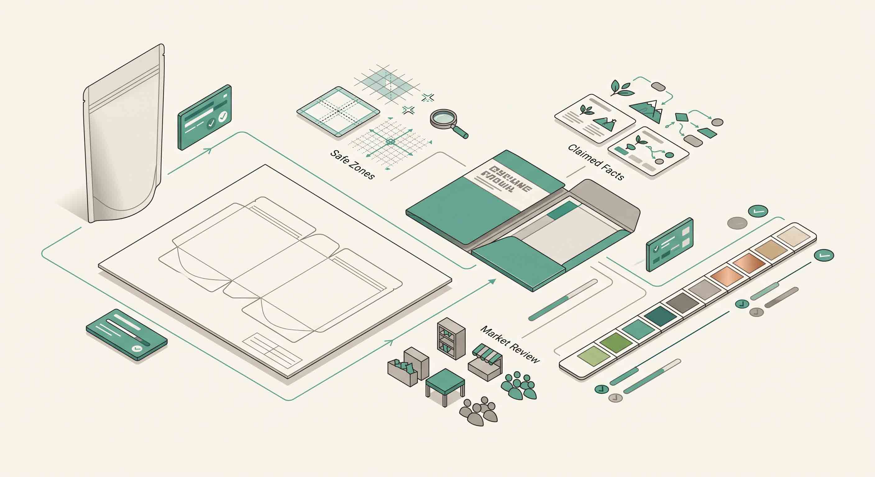
Leave physical clearance around seals, folds, closure zones, tear features, and gussets. Text that looks correct on a flat file can become hard to read when it crosses a fold or becomes too close to a seal. The printer or packaging supplier should provide the approved dieline and safe areas for the selected format; do not build a production file from a web image or an assumed template.
Use claims carefully in tea packaging copy
Tea packaging often uses words that sound benign but have a claim burden: “plastic-free,” “recyclable,” “compostable,” “natural,” “non-toxic,” “eco-friendly,” “freshness locked,” and “premium quality,” among others. Some are environmental claims; others may imply product or performance outcomes. The final wording should be reviewed against evidence for the complete package, target market, and intended use.
For U.S. marketing, the FTC’s Green Guides are a useful starting point for evaluating environmental marketing claims. They do not give a blank approval for a generic icon or adjective. A package can include multiple components with different collection or disposal conditions, and a claim that sounds true for one component can be misleading if it appears to describe the whole pack. The same caution applies to material and food-contact language: documentation needs to match the actual material structure, food, market, and use conditions.
The design task is to leave space for substantiated statements, not to invent a sustainability narrative before the evidence exists.
Let the physical format influence the graphic design
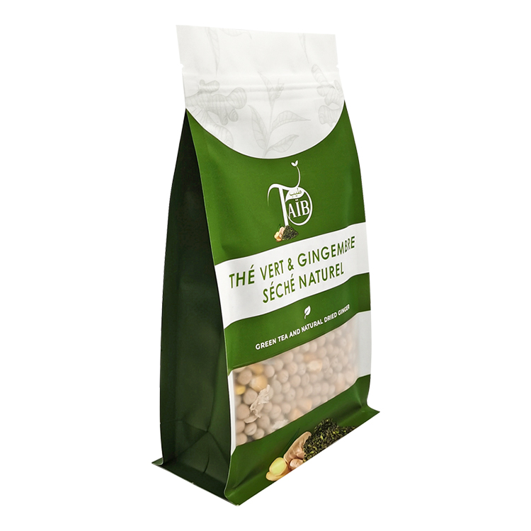
The same artwork does not behave identically across a flat pouch, a stand-up pouch, a box-bottom pouch, an envelope, and a carton. A wide flat pack favors a different front-panel composition than a narrow upright pouch. A gusset can carry useful information, but it may not be the best location for an essential front-facing statement. A clear window can change the color and contrast of nearby design elements depending on the product behind it.
Review artwork on the actual candidate structure. Ask whether the product name remains visible when the pouch is partly filled, whether a large illustration wraps across a fold, whether a dark area will sit near the closure, and whether a shelf-facing panel is really the panel that shoppers will see. This is especially important for flexible pouches, which change shape with their fill.
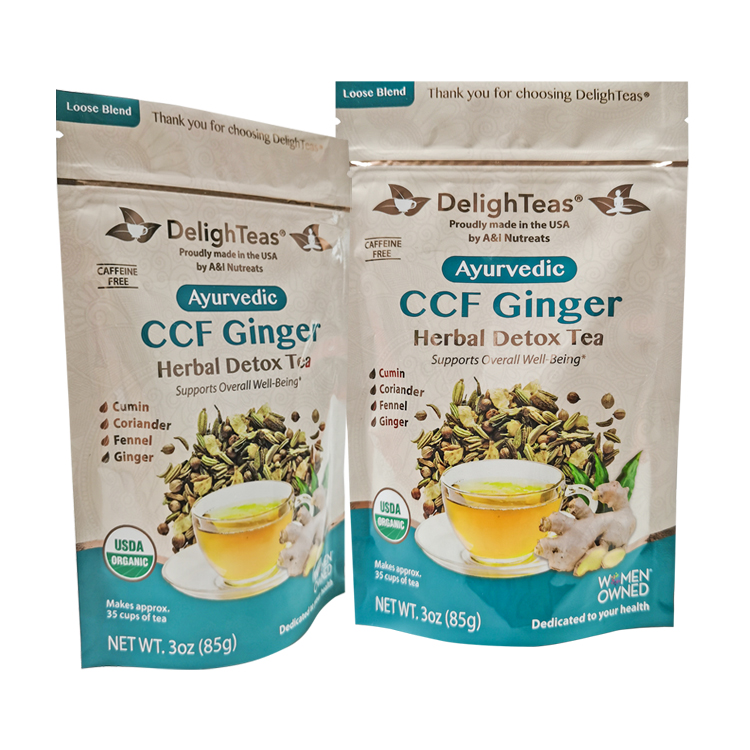
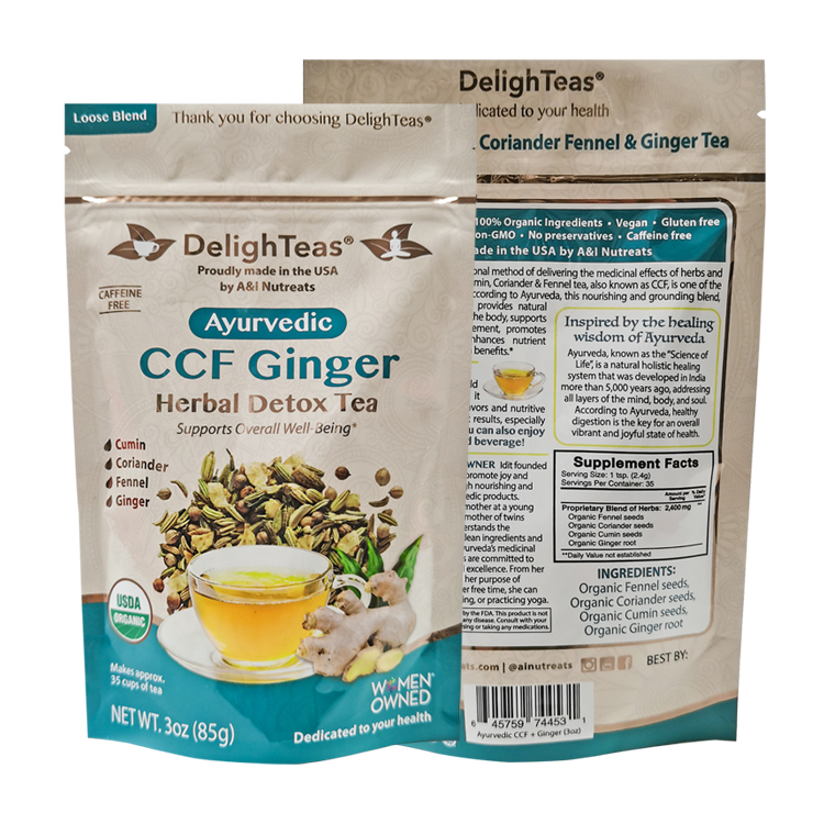
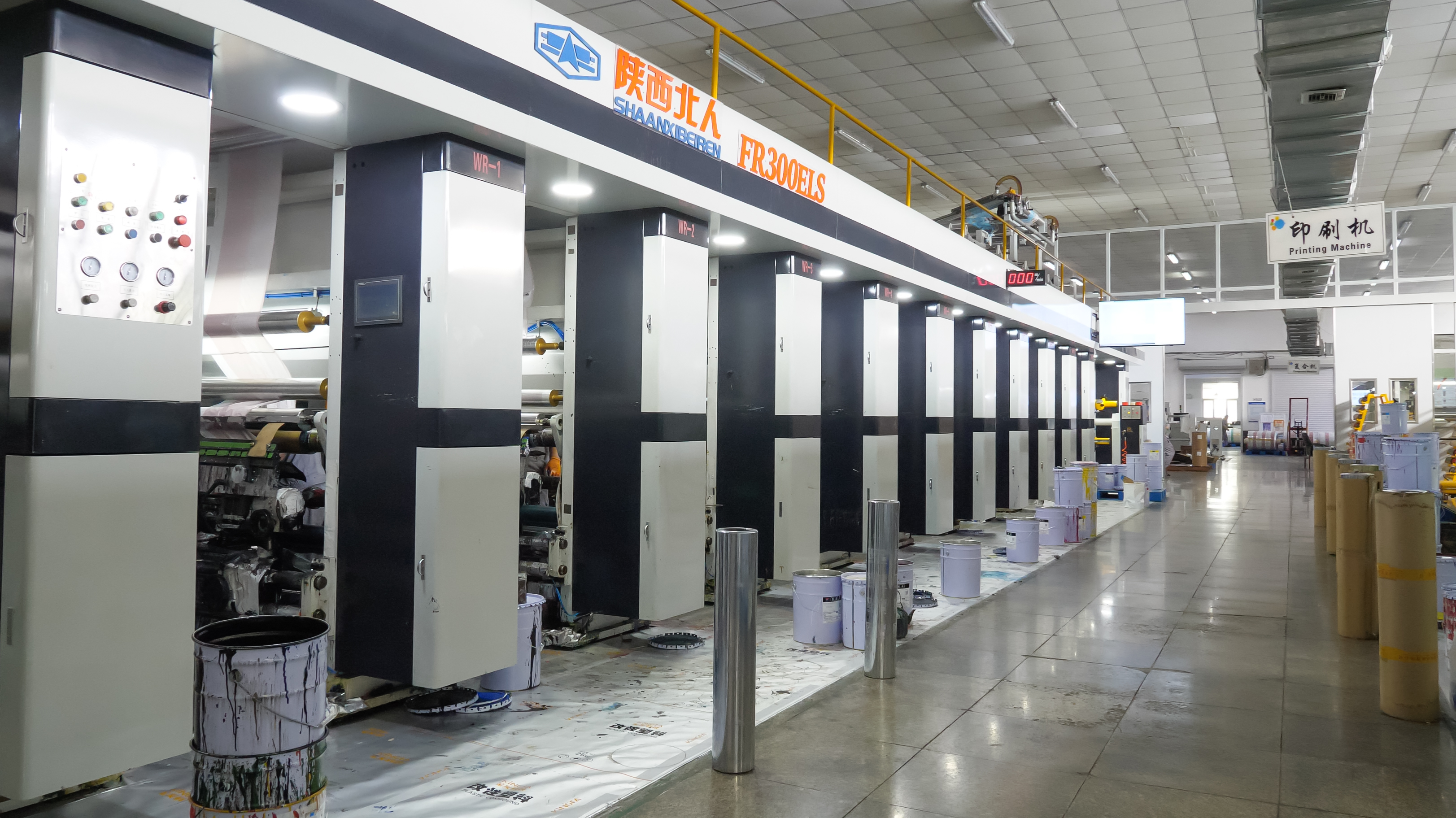
Two public tea-project records illustrate how design details can be documented. One records a 125 g green-tea pouch with a box-bottom format, MATOPP/VMPET/PE, and gravure printing; the other records a 3 oz stand-up pouch with Spot UV. They show that a project can combine product, format, dimension, and finish. They do not establish that a particular design, material structure, finish, or effect is suitable for another product.
Prepare artwork for a real proof, not just a screen review
Screen approval is a useful stage, but it is not the last stage. A package will be viewed under retail lighting, handled, folded, filled, photographed, and sometimes placed beside multiple variants. Before production approval, review the artwork at actual size and in the selected pack form.
Use this proof checklist:
- Confirm that the file uses the supplier’s current dieline and clearly marked safe areas.
- Check all text at intended print size, including any content on back panels, sides, folds, or envelopes.
- Make sure key product identity is not hidden by a fold, gusset, closure, label placement, or expected fill line.
- Compare every flavor or blend variant side by side to find naming and color collisions.
- Check barcode, code, or label areas with the team that will apply and verify them.
- Review the final filled mock-up, not only an empty structure.
- Obtain required sign-off from the people responsible for product facts, brand, market requirements, and production.
If the pack will include a window, metallic effect, matte or gloss contrast, or other special appearance, request a physical or production-representative proof where the supplier can provide one. A mock-up remains a planning tool; do not describe it as a guaranteed production match unless the relevant parties have confirmed that standard.
Keep the back panel useful
The back panel is often where a tea brand tells its story, gives brewing guidance, and provides practical information. It should be organized for scanning rather than treated as leftover space. Use headings, grouping, contrast, and adequate spacing so a customer can find what they need after purchase.
Separate product storytelling from objective instructions. A concise origin or blend narrative can give the product personality, while brewing guidance should be clear and based on the brand’s approved preparation method. Do not make health, medical, or sensory guarantees that the responsible team cannot substantiate. If directions vary by tea type, make sure the variant-specific information is not accidentally reused across the range.
For a gift pack or a multi-flavor carton, provide a simple way to identify the individual units once they are separated. That might involve clearly differentiated envelope names or a well-organized key on the carton; the appropriate solution depends on what the user sees at the moment of brewing.
A reusable tea packaging design brief
Use this short brief before beginning artwork:
This document creates a shared basis for a designer, brand owner, packaging supplier, and co-packer. It also helps prevent late changes caused by missing information or a mismatched structure.
From design brief to tea packaging project
Once the actual tea, selling unit, format, design needs, and destination are defined, custom tea packaging can be discussed with a project brief rather than a purely visual request. Include the product sample details, target packaging format, artwork status, and questions that need a physical proof or supplier documentation. That keeps the commercial discussion tied to real product requirements.
Use a final artwork preflight
Before the file is released for production, run a short preflight with the responsible people rather than asking one person to catch every issue. Verify the current dieline, versioned copy, product facts, variant names, language treatments, barcodes or code areas where applicable, non-print zones, and any claim that needs evidence. Compare the final flat file with the filled physical sample, because a pouch or envelope can reveal a fold or seal conflict that a screen proof hides.
The preflight should also make unresolved decisions visible. If a material claim is awaiting confirmation, mark it as pending and do not let a placeholder green icon become the final artwork. If a market-specific label requirement has not been approved, keep that artwork version outside the production release. A controlled preflight protects the design system while letting the team update facts deliberately rather than through last-minute edits.
Frequently asked questions
What should be on the front of tea packaging?
The front should make the brand, product identity, tea format, and key variant cue easy to recognize. Exact mandatory content depends on the product and selling market, so validate the final layout with the responsible team.
How can a tea range look consistent without making flavors confusing?
Use repeated layout elements and a clear type hierarchy, then distinguish variants with written names and more than one visual cue. Test the full range at actual size, including thumbnails and shelf-style viewing distances.
Can I put “recyclable” or “compostable” on tea packaging?
Only when the claim is substantiated for the complete package and its relevant components in the target market. Unqualified environmental claims can be misleading; review current evidence, collection conditions, and local rules before using them.
When should I get a tea packaging dieline?
Use the packaging supplier’s current dieline after the candidate format has been selected. The final artwork must respect its folds, seals, gussets, closures, bleed, and safe areas. Do not use a generic online template for production.
Should a tea pouch use a window?
A window is a project-specific design and product decision. Evaluate it with the actual tea, the desired look, the information layout, and the final material specification. Do not assume it has the same effect on every tea or pouch.
Sources
- FTC Green Guides topic page: https://www.ftc.gov/news-events/topics/truth-advertising/green-guides
- FDA food-contact overview: https://www.fda.gov/food/food-ingredients-packaging/food-packaging-other-substances-come-contact-food-information-consumers
- Related Project, 125 g tea pouch: https://www.mylarbag.net/products/food-packaging/custom-matte-flat-bottom-tea-pouch-with-clear-window-matoppvmpetpe-for-125g-loose-leaf-green-tea-herbal-blends
- Related Project, 3 oz tea pouch: https://www.mylarbag.net/products/food-packaging/custom-3oz-stand-up-pouch-for-loose-leaf-tea-high-barrier-vmpet-packaging-bag-with-spot-uv-anti-static-design
- Mylarbag commercial destination: https://www.mylarbag.net/custom-tea-bags