
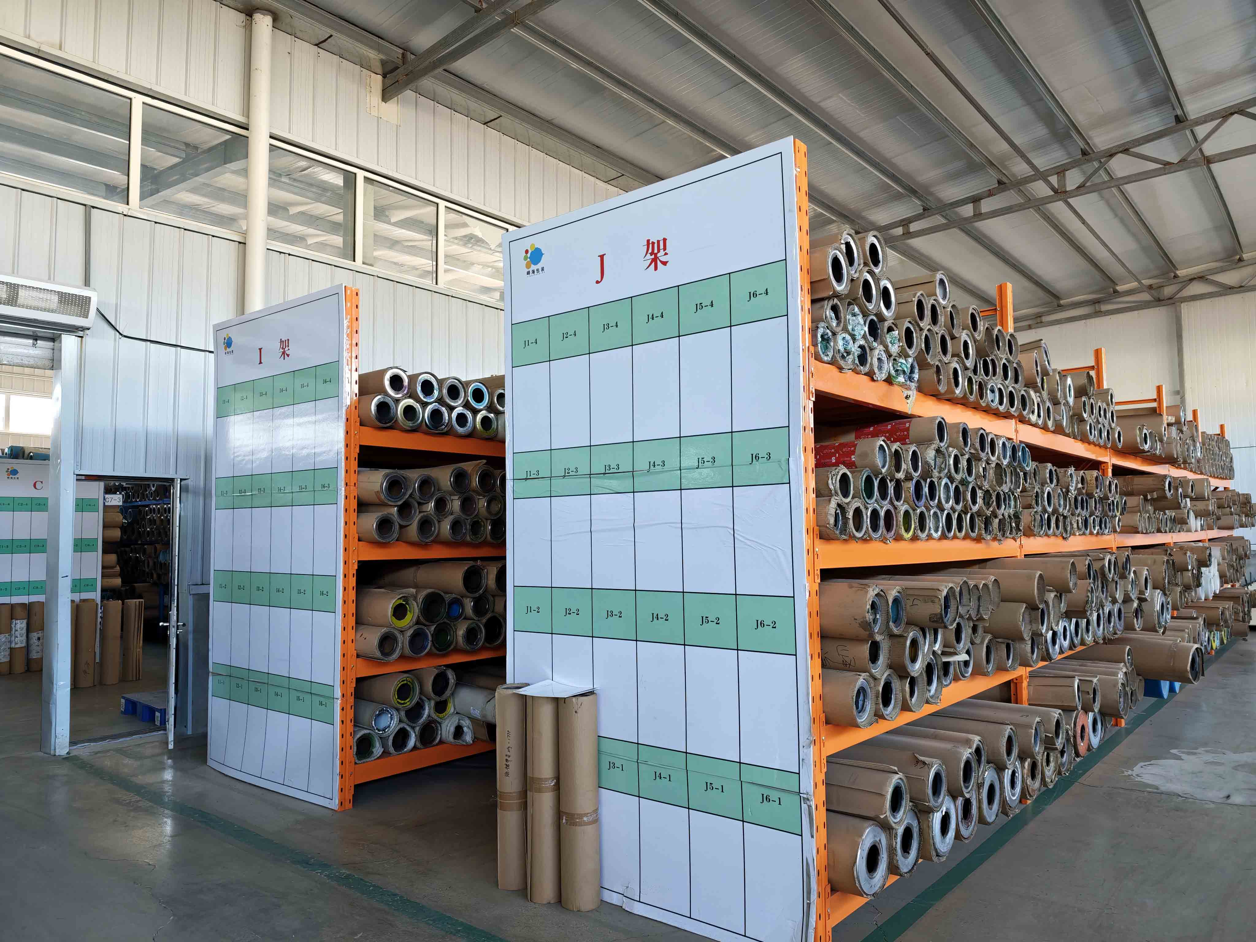
Coffee packaging design should begin with the real pouch, not a flat mock-up. Choose the pouch direction and target fill first, then map the artwork to its panels, top seal, valve, zipper, gussets, and product-information areas. Keep the current pouch brief with the current artwork version through sampling and review. That prevents a polished screen design from being approved for the wrong physical coffee bag.
This guide applies to a proposed custom coffee pouch, not a published product result or a promise of a production outcome.
Start With the Pouch, Not a Blank Rectangle
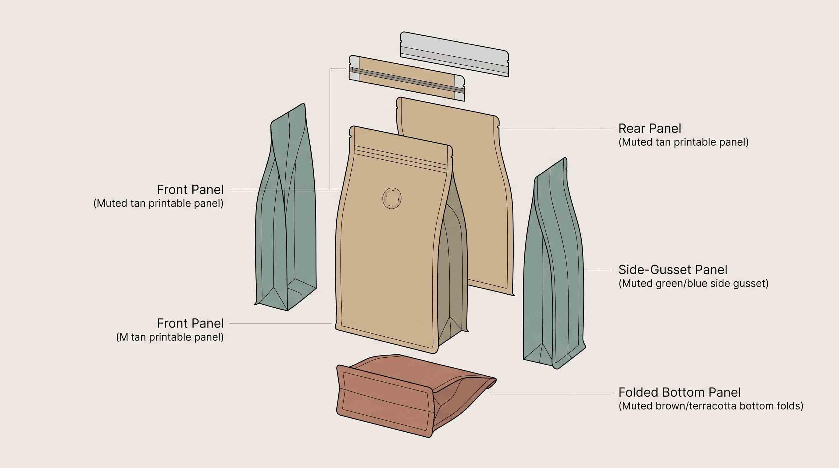
Coffee bags do not all have the same printable surface. A flat-bottom pouch can have front, back, side, and bottom panels. A stand-up pouch uses a different front, back, and bottom-gusset relationship. A side-gusset bag has expandable sides and a tall profile. A flat pouch has another set of constraints.
The format determines where information can appear and where it cannot. Seals, gussets, valves, zippers, tear features, and folds are part of the layout. Before a designer finalizes the hierarchy, the team should know the proposed pouch format, dimensions or sample reference, target fill, and planned features.
This does not mean the design has to wait until every production detail is final. It means the artwork should identify what is still open. A working concept can be reviewed against two pouch formats. A final file should not be approved against a generic outline when the real pouch format is known.

Define the Product Information and Design Hierarchy
Before arranging decorative elements, list the information that needs a place on the pouch. The exact information and review process depend on the coffee product and target market, so do not copy the text from another brand or country without checking what applies to your project.
A practical first list separates the elements that drive the layout from the elements that can move later:
The table is a planning tool, not a legal labelling checklist. A packaging supplier can help map a proposed layout to a pouch format, but the brand is responsible for confirming the product information and market requirements that apply to its own sale.
Choose a Format Before Building the Final Layout
The most attractive coffee design can still be difficult to use if it assumes the wrong format. Decide which pouch direction is being evaluated before the layout is locked:
It is often helpful to keep two format directions in a working design phase. For example, a brand may compare a flat-bottom pouch and a side-gusset pouch before it knows which profile better suits the coffee and shelf plan. In that case, do not tell the designer to make one final file that silently assumes both formats are identical. Maintain a version for each format or mark the points that need revision after selection.
Design Around the Top Area: Seal, Valve, and Reclose Feature
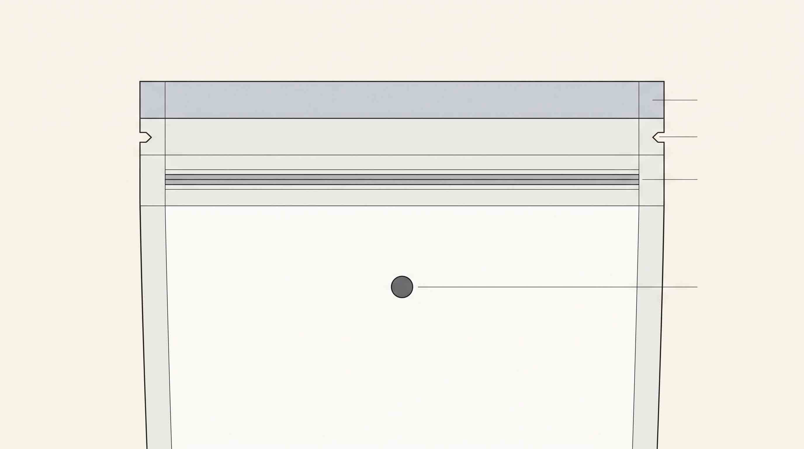
The upper part of a coffee pouch often carries more than artwork. It may include the first seal, a tear feature, a valve, a zipper, or a fold-and-tin-tie arrangement. These items are not interchangeable and should not be added after the final artwork is already approved.
Separate the first opening from later reclose. A top seal can be part of the initial closure. A zipper, pocket zipper, or tin tie may be used after opening. A valve serves another purpose in the overall pouch configuration. The design job is to reserve the required areas and make the visible layout work with the proposed feature positions.
Ask the supplier for the layout information that belongs to the selected pouch. Then show the designer where an important product name, pattern, colour transition, or fine detail should not be placed. This avoids trying to force a complex graphic through a seal, feature, or gusset area at the last minute.
Build a Multi-SKU System Before Adding Variations
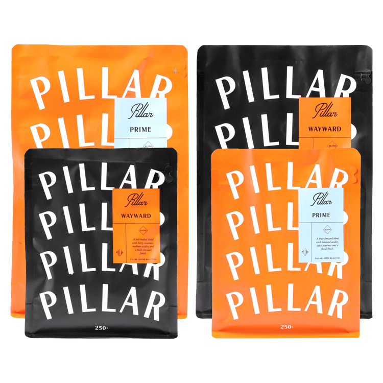
Many coffee brands sell more than one roast, origin, blend, grind option, or seasonal release. A packaging system can keep those products related while still allowing the buyer to identify the right bag. The key is not to repeat the same decorative element everywhere; it is to decide which visual elements stay fixed and which change from SKU to SKU.
One approach is to keep a stable brand position, type hierarchy, and pouch format while changing a colour field, origin cue, illustration area, or product-specific panel. Another project may use a common surface finish but change the front artwork. The right approach depends on the product range and the final pouch layout.
Before producing several files, make a version list. Record the SKU name, target fill, pouch format, artwork version, colour or variation direction, and any open feature question. This makes it easier to detect when an artwork change belongs only to one pouch rather than the entire coffee line.
Use Published Pouch Projects as Configuration References
Real project records are useful because they show how artwork, pouch format, printing direction, material notation, dimensions, and features can appear together in one published configuration. They are not a licence to reuse another customer’s visual identity or assume the same outcome for a different product.
The published 12oz project record lists a digitally printed MATOPP/VMPET/PE flat-bottom pouch in a 15 × 26 + 6 cm format, with a side zipper and a degassing valve. It is a useful reference for how one multi-panel pouch and its listed features can be documented. See the 12oz flat-bottom coffee-pouch project record.
The published 250g project record describes a gravure-printed MATOPP/VMPET/PE flat-bottom pouch at 14 × 18.5 + 7.5 cm, with a valve and a pocket zipper. It gives the design team a second, differently configured reference point. See the 250g flat-bottom coffee-pouch project record.
Use the records to ask what needs to be defined for your own pouch. Do not infer the brand’s sales, customer motivation, material performance, print result, price, production timing, or regulatory status from them.
Prepare Artwork Files for a Useful Review
Before sending artwork for a pouch discussion, label the current version clearly. Include the pouch format and target fill in the project file. If a physical sample or reference pouch exists, include a photograph or a note that identifies it. The goal is to keep the design conversation connected to the same physical package.
The supplier may need to know whether the artwork is a concept, a working layout, or a file ready for production review. If the artwork still needs changes, say so. It is better to review an identified working version than to have different people assume that an old PDF, an exported image, and a current design file are the same thing.
This is not a substitute for the production files or approvals required by a particular project. It is a way to make a design review useful before those final steps are reached.
Keep a Small Decision Record Beside the Artwork
An artwork file cannot always explain the whole packaging decision. A PDF may show a front panel clearly, while the current pouch direction, feature placement, or target fill lives in a separate message. That is how a team can end up discussing the same design with different physical assumptions.
Keep a short decision record beside the working artwork. It does not replace a technical file, a sample, or a formal approval. Its purpose is simpler: it lets the designer, buyer, and supplier see which parts of the brief are settled and which parts still need a project-specific answer.
Use direct language in this record. “Flat-bottom pouch under review; dimensions not yet selected” is more useful than leaving the file to imply that a generic mock-up is final. The same applies to a colour, finish, or closure feature: note it as a discussion item until it is actually approved for the project.
At each artwork review, compare the decision record with the file on screen. If the format, target fill, top feature, or panel map has changed, update the record before the next person begins working. That small step gives the team a clear way to separate a current design direction from an assumed production specification.
Review the Design on a Physical Sample
A physical pouch sample brings the panel layout, filled shape, feature placement, and top area into one object. Use it to review what the sample can show: whether the main front panel is visible as intended, whether the feature locations are sensible, whether the pouch format suits the target product, and whether the artwork needs a new version.
Do not treat a sample as evidence of a universal material claim, a shelf-life result, food-contact status, recyclability, compostability, or market approval. Those questions require their own current project information. The sample review should remain focused on the format, artwork, features, and intended packing process.
Design for the Actual Filling and Sealing Routine
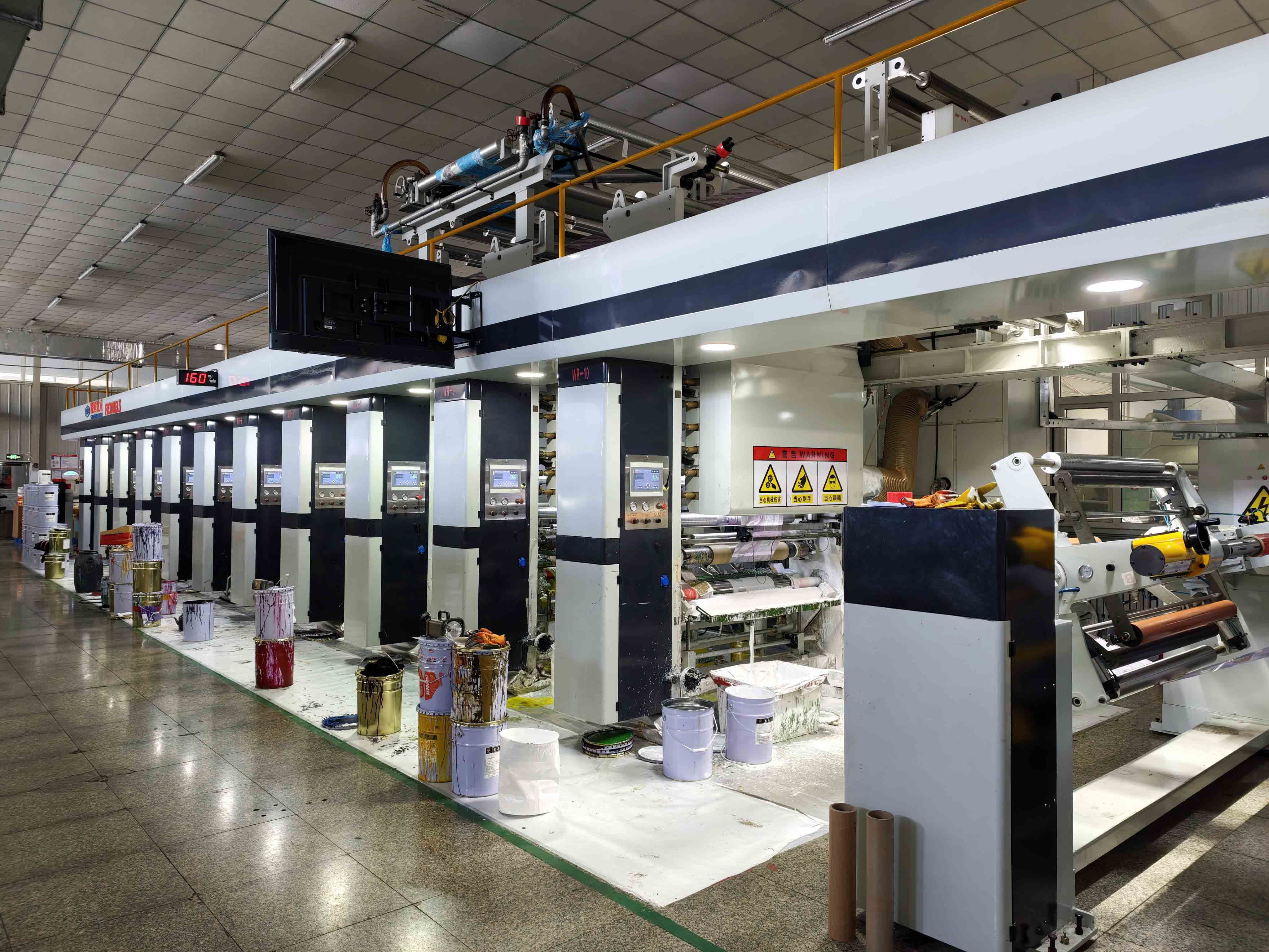
The design team does not need to run the filling line, but it should know enough about the packing routine to avoid conflicts. Ask how the pouch will be filled, where the final seal will be made, and how the feature layout relates to that process. A graphic that runs into a sealing area or a product name placed where a gusset folds may need adjustment even when it looked balanced in a mock-up.
The same issue applies to a pouch that will be handled in a warehouse or prepared for shipment. The design should not make assumptions about the final packing arrangement, delivery result, or logistics performance. It should simply leave the final pouch configuration clear enough for those separate discussions.
Use Colour and Finish as Part of the Same Design Decision
Colour, surface finish, and special details should be discussed against the current pouch and artwork, not treated as a separate visual layer added at the end. A matte surface, gloss direction, foil element, Spot UV area, or other finish can change how a panel is read. It can also change which artwork detail needs the clearest placement.
Begin by identifying the visual result the brand is trying to achieve: a restrained natural look, a bright retail signal, a premium dark presentation, or another direction. Then keep the request specific. State which panels are involved, whether the feature is part of the working artwork, and whether the pouch format has already been selected. This gives the supplier a defined project question instead of a request for a vague “premium finish.”
Do not describe a finish as proof of durability, quality, environmental performance, or a customer outcome unless the relevant claim has separate current evidence. In a design brief, its job is to identify the visual and tactile direction the team wants to review.
Common Coffee-Pouch Design Problems to Catch Early
Most late artwork changes are not creative failures. They come from a design file and a pouch brief referring to different things. An early review can catch the following issues before the project reaches a final approval stage.
The table is not a substitute for a technical prepress review. It is an internal conversation tool. It keeps the designer, roaster, and supplier focused on the same pouch instead of asking one person to solve a physical packaging question from a flattened image.
Keep Digital and Gravure Discussions Separate From the Design Brief
The artwork and the print method relate to each other, but they are not the same decision. A coffee brand can prepare a clear pouch layout and then discuss whether a digital or gravure printing direction should be evaluated for that specific project. The answer depends on the current pouch, artwork, product range, and project requirements; it should not be inferred from a design style alone.
When discussing printing, provide the current artwork version, number of variants, pouch format, finish direction, and the questions that remain open. Keep the response linked to the same pouch brief. This avoids comparing a print discussion for one format or set of artwork files with another proposal that describes a different package.
Published Mylarbag manufacturing information identifies 10-color gravure and HP Indigo 25K digital printing among the available production capabilities. That fact does not set a fixed cost, timing, colour, or quality result for every coffee design. For the printing-method decision itself, use the related coffee-bag printing guide after the basic pouch and artwork brief is clear.
That sequence keeps design and print decisions connected.
Recommended Packaging Configuration: Pair the Design With a Pouch Brief
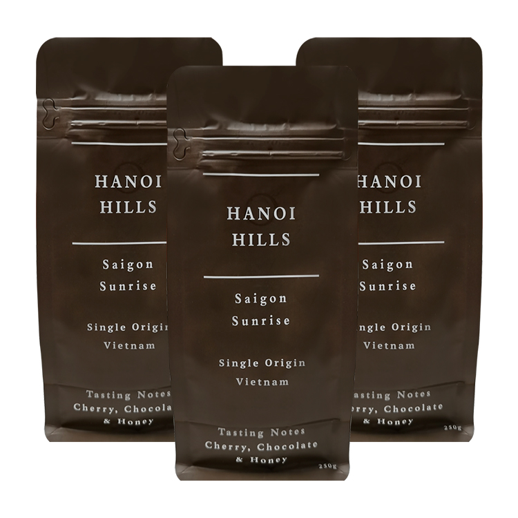
For a new custom coffee bag, the recommended starting point is a pouch-and-artwork brief for evaluation. It should identify the coffee product, target fill, format direction, reference size or sample, valve or closure needs, current artwork version, finish direction, target market, and packing process. The final material, dimensions, features, and production files can then be reviewed for that specific project.
Use custom coffee bags to begin the pouch and artwork discussion. When the project brief is ready, use Contact to provide the product, design, pouch, and open-question details. This is a practical handoff from brand concept to a package that can be evaluated, without claiming that a sample, case image, or generic design will be right for every coffee line.
A Design Handoff Checklist
Before an artwork file moves to the next project stage, compare it with the current pouch brief.
If one item refers to a different pouch or artwork version, pause before approval. A clear open question is more useful than an outdated file that looks finished.
Frequently Asked Questions
What should be on a coffee bag design?
Start with the product and information that need a planned place on the pouch, then map them to the actual format, panels, seal area, and feature positions. The exact product information depends on the project and target market.
Should I design the coffee bag before choosing the pouch type?
You can develop a concept early, but choose the pouch direction before finalizing the layout. Different formats use panels, gussets, and feature areas differently.
Does artwork transfer unchanged between pouch formats?
Do not assume that it will transfer unchanged. Review the artwork against each pouch’s panel map, dimensions, top area, and feature positions.
What is the difference between a coffee bag mock-up and a production-ready layout?
A mock-up communicates a visual idea. A production-ready layout needs to match the current pouch format, dimensions, panels, features, and project-review process.
Do valves and zippers affect coffee bag design?
Yes. They occupy physical areas of the pouch and should be considered together with the seal and artwork layout.
Where can I begin a custom coffee packaging design discussion?
Begin with a custom coffee-bag enquiry and include the coffee product, target fill, pouch direction, artwork version, features, reference size, target market, and packing workflow.
Turn the Design Into a Defined Pouch Project
The goal of coffee packaging design is not only a strong front panel. It is a design that belongs to the actual pouch, product, features, and packing process. Visit custom coffee bags to start the next step with a clear pouch and artwork brief.