
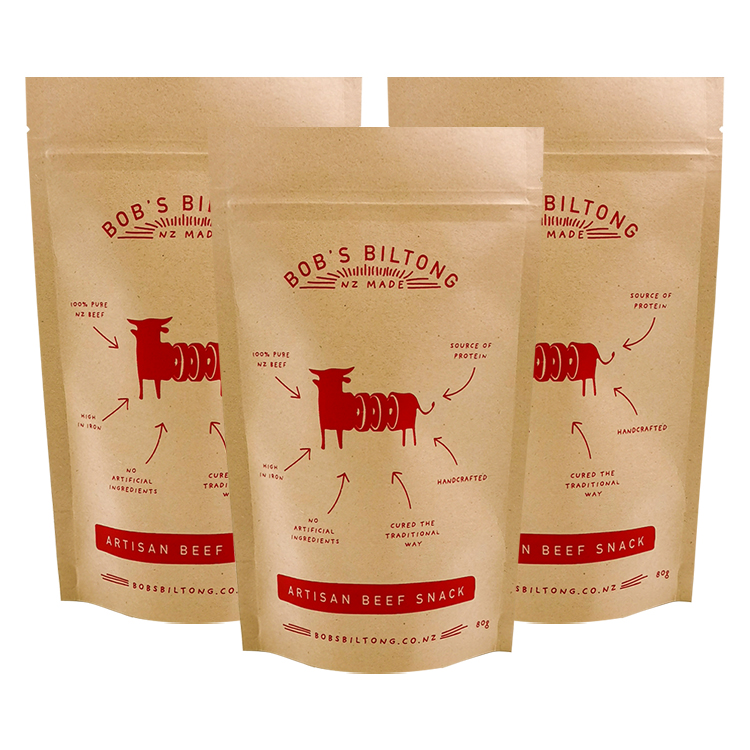
Short answer: Start with the actual product, target net weight, sales channel, and filling method. Then choose a pouch format that can be filled and sealed, reserve the space needed for approved label information, and build artwork on the supplier's final dieline. Compare printed, filled samples at actual size before approving a production run. A striking screen mockup is only one part of a workable beef jerky packaging design.
Some brands want a kraft look and a small window. Others need a strong color system across six flavors, a compact hanging pack, or a large pouch that stands neatly on a shelf. Each can work. The useful question is not which look is universally best. It is which design lets a buyer recognize the product and flavor, allows the packer to fill and seal the bag consistently, and survives a real print and handling trial.
This is a design and procurement guide for brands ordering custom retail pouches, primarily for the US market. It is not a jerky processing guide or a substitute for label approval. A brand should confirm the applicable meat-product labeling rules, inspection context, and claims with its own regulatory and quality team. If you need the broader workflow from product definition through shipping, see our guide to packaging beef jerky for sale. Here we stay with the design handoff: format, panels, window, dieline, print proof, and filled sample.
What are some beef jerky packaging designs that work in practice?
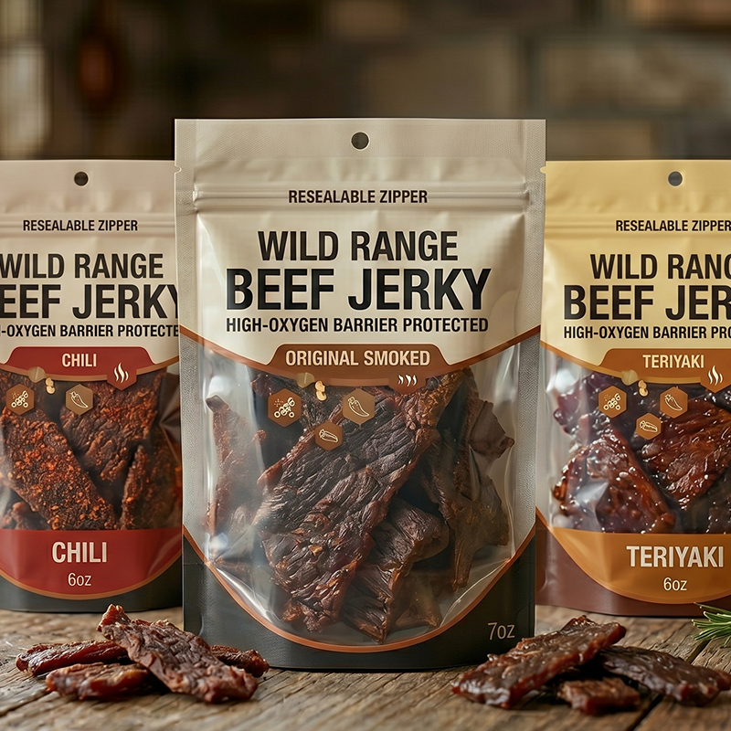
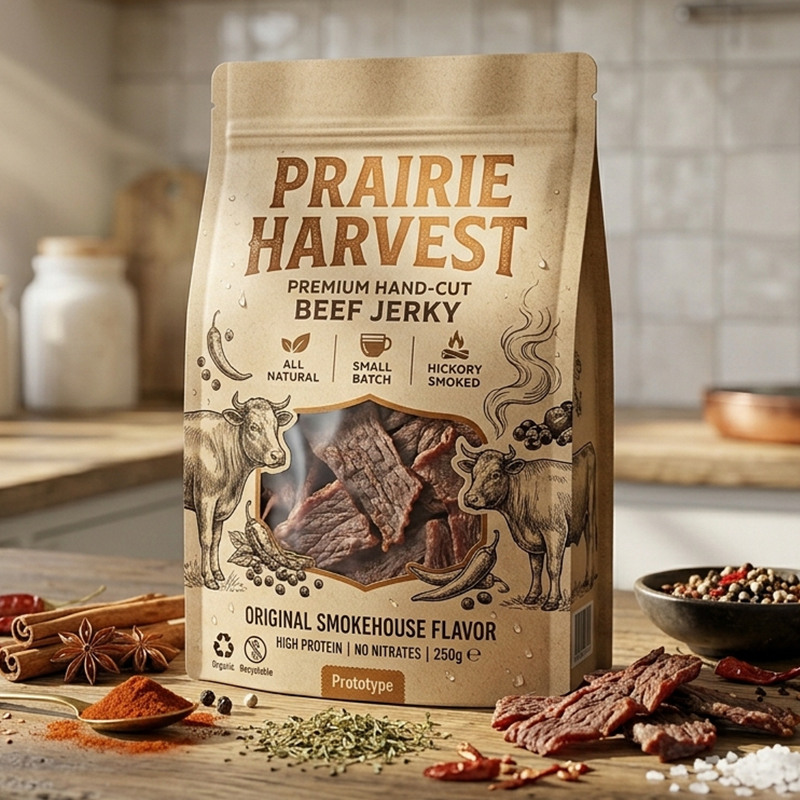
Four starting directions cover most conversations with a packaging supplier: a compact flat pouch, a resealable stand-up pouch, a flat-bottom pouch, and a larger gusseted pack. A design direction becomes useful only after you specify the intended product amount, how it will be displayed, and who will fill it. A small single-serve pack that hangs on a peg has different constraints from a multi-serving pack photographed for an online store.
The beef jerky bag range shows several of these formats. Its format images are examples of available design directions; they are not evidence that a format suits every recipe or packing line. Make a shortlist, then ask for blanks or representative samples before committing to artwork. The dimensions printed on a drawing do not tell you how irregular strips of meat will occupy the inside of a pouch.
Match the design to the place where it will be seen
A grocery shelf rewards a clear product name and a flavor cue that can be picked out from a short distance. A peg display may hide the upper portion behind its neighbors; the hang hole, tear notch, and header consume valuable area. An online listing turns the pack into a tiny image. If every flavor differs only in a narrow line of type, shoppers may not notice the distinction at thumbnail size. A club or bulk pack has another job: it should still read clearly after the product settles and the side panels bend.
Make three low-cost views before discussing elaborate finishes: a full-size front printout, a photo of a filled blank standing in its intended orientation, and a small ecommerce thumbnail. Ask people who have not seen the project to identify the product type and flavor from each view. Note where they hesitate. This is a practical way to improve information hierarchy; it is not a promise that one design will maximize sales.
The back and sides matter as well. A large front logo is little help if the back panel folds through essential copy or the planned variable-date area lands over a gusset. Decide which surfaces remain flat and legible when the bag is filled. A supplier can show where the seals and folds will be. The brand still needs to decide what the consumer must read and have the legal content approved.
Write the brief before anyone draws the final artwork
An artwork team can move quickly when the pack specification is stable. It can also lose days polishing a front panel that later has to shrink for a wider seal, a different zipper, or a larger net-quantity statement. Treat the brief as a short decision record shared by brand, packer, regulatory reviewer, and pouch supplier.
If any answer is provisional, mark it provisional. For example, “window requested, pending barrier and filled-sample review” is a better specification than a mockup that silently assumes the window is approved. The same applies to a zipper: show its proposed location, then test whether it remains accessible after the consumer tears the top open.
At the first meeting, ask what would trigger a redesign. It might be a new net weight, a new case pack, a different inspection legend, or a new language requirement. Logging these triggers prevents a change in one part of the project from slipping past the printer. Once the physical pouch is fixed, every layout change should refer back to a controlled drawing version.
Do not choose bag size from net weight alone
Two 80 g products can fill the same pouch very differently. Long strips bridge across the opening. Smaller pieces settle into the gusset. A sticky or oily surface can create a different visible pattern behind a window and may complicate a clean top seal. Test more than the prettiest hand-packed sample. Ask the packer to fill representative pieces from normal production and record whether the bag stands, how the face looks, and whether the top can be sealed without product in the seal area.
Blog 5 in this series will deal in detail with why bags can look partly empty. For this design brief, the consequence is simple: approve a pouch by looking at a real filled sample, not by placing an “80 g” label on an empty render.
Give each panel one clear job
The principal front panel has limited space. Start with the identity a customer needs immediately: brand, recognizable product type, flavor or variety, and the required net-quantity information. Place decorative elements around that hierarchy, not on top of it. The back and side panels can support fuller product copy, approved instructions, and code or batch areas where appropriate. The exact required information and placement depend on the product and market.
For US meat products, the USDA FSIS checklist of mandatory label features is a starting reference. The current 9 CFR 317.2 addresses required features and principal display panel considerations for meat labels. Use the current official materials and your regulatory reviewer for the specific product. A bag maker can reserve space and reproduce approved artwork; it should not decide the product name, ingredient statement, inspection information, or eligibility of a marketing claim for the brand.
Build a panel map with four layers of information:
- Fixed identity: the brand and product name that should remain recognizable across sizes and flavors.
- Variable SKU information: flavor, heat level, size, or language version, each tied to a controlled artwork file.
- Required and reviewed copy: approved content with enough room to remain legible on the finished, filled surface.
- Production-variable information: reserved space for any date, lot, or other code applied on the packing line, plus verification that the chosen ink and surface can be read after handling.
Do not position text solely by zooming in on a screen. Print at 100% scale and wrap it around a blank or trial pouch. Fold the bottom, account for the side seal, and view it under the lighting where the pack will be inspected. A logo may be centered on a flat dieline but look off-center when a stand-up bag opens. A small flavor banner may vanish in the shadow of a gusset. These are cheap discoveries at the paper-proof stage and expensive ones after printing.
Make flavor variation obvious without depending only on color
A family of products needs both consistency and separation. Keep the brand mark, product name, and main layout stable; change the flavor name, an approved product photograph if used, and a distinct visual cue. Compare the full set at shelf scale and as online thumbnails. If a mild flavor and a hot flavor share almost identical fronts, the problem is not solved by adjusting color a few percent.
Use words and contrast as well as color. Record every SKU in an artwork matrix: exact displayed name, file identifier, revision, approved ingredient and allergen text, net weight, barcode supplied by the brand, and approving person. The printer should receive a single release package, not loose files named “final,” “final2,” and “new final.” A flavor-specific ingredient change is a label-control event, not merely a color change.
Decide whether a window helps this particular pack
A clear window can show real product texture and reduce the gap between a photo and the contents. It also takes space from artwork and changes the pack's light-exposure and barrier design. Whether that trade is acceptable depends on the actual product, desired display, laminate construction, distribution conditions, and validated shelf-life plan. A photo of a windowed pouch in another category does not prove that a window is right for this jerky.
Ask five questions before cutting a shape into the design:
Avoid treating a narrow strip as a universal compromise. If the product settles below it, the strip may show air rather than meat. If the window extends into a fold, it may distort the intended shape. If it reveals only a dark mass in poor store lighting, an honest product photograph on an opaque pack might communicate more clearly. Try both options with the same product and assess them in the channel where the customer will actually see them.
An opaque printed pouch also leaves more room for a coherent flavor system. Kraft appearance may suit one brand's visual language, but a paper-look exterior does not tell you what the inner layers are, whether the package has a local recovery route, or how it performs. Check the full construction and avoid recycling or freshness claims drawn from appearance alone. The material and shelf-life questions belong in the Mylar and shelf-life guide; the design task is to make room for claims only after they have been substantiated.
Turn the approved concept into a print-ready dieline
The dieline is the supplier's map of the actual pouch: trim and finished dimensions, seals, bottom fold, zipper, tear notch, possible hang hole, and any window. Get the version tied to the agreed bag construction. Do not take a template from a different width, gusset, or zipper style and move the artwork over by eye.
For every panel, ask the supplier to identify four working zones: printable surface, bleed where artwork must extend beyond the visible edge, a safe area for important copy, and areas affected by seals or folds. Ask for the supplier's actual tolerances and artwork specification rather than copying a generic millimeter allowance from another project. Registration, seal width, and converting method can change the useful area.
An effective prepress handoff contains more than a PDF preview:
- The controlled dieline file with version, finished dimensions, and orientation.
- Editable or production-ready artwork in the supplier's accepted format, with linked assets and fonts handled as agreed.
- A color reference or approved proofing method, including the material and finish on which colors will be judged.
- Clearly named spot colors or special effects where specified, with a marked area for each.
- A SKU matrix tying every file to its flavor, weight, language, barcode, and revision.
- Approved label copy and signoff from the party responsible for the food label.
- A marked variable-code area and a test of readability on the proposed finish.
- A written list of features that must align: window, tear notch, zipper, hang hole, seals, and any registration-sensitive graphics.
Never approve the proof only because the artwork looks good when the pouch is flat. Photograph the printed and filled sample from straight on, at a slight angle, and while held at the top. See whether the design remains coherent as the gusset opens and the front curves around the product. Check the first-open path too: a tear notch that slices through a line of copy is a layout failure even if the printing is sharp.
Print proof, production proof, and filled sample answer different questions
A digital artwork preview checks wording and composition. A color or press proof helps judge how the art prints under the agreed process and substrate conditions. A converted empty pouch checks folds, seals, registration, zipper and tear features. A filled and sealed sample checks the actual silhouette and whether the text, window, and opening still work. Do not use one approval to stand in for the others.
If a late change touches an allergen statement, flavor name, pack size, seal width, or window, reopen the relevant gates. A new PDF with the same filename is not sufficient evidence of approval. A simple revision table with dates and signoffs often prevents the wrong flavor file from reaching a press more effectively than a long email thread.
Pick a printing route for the actual SKU plan
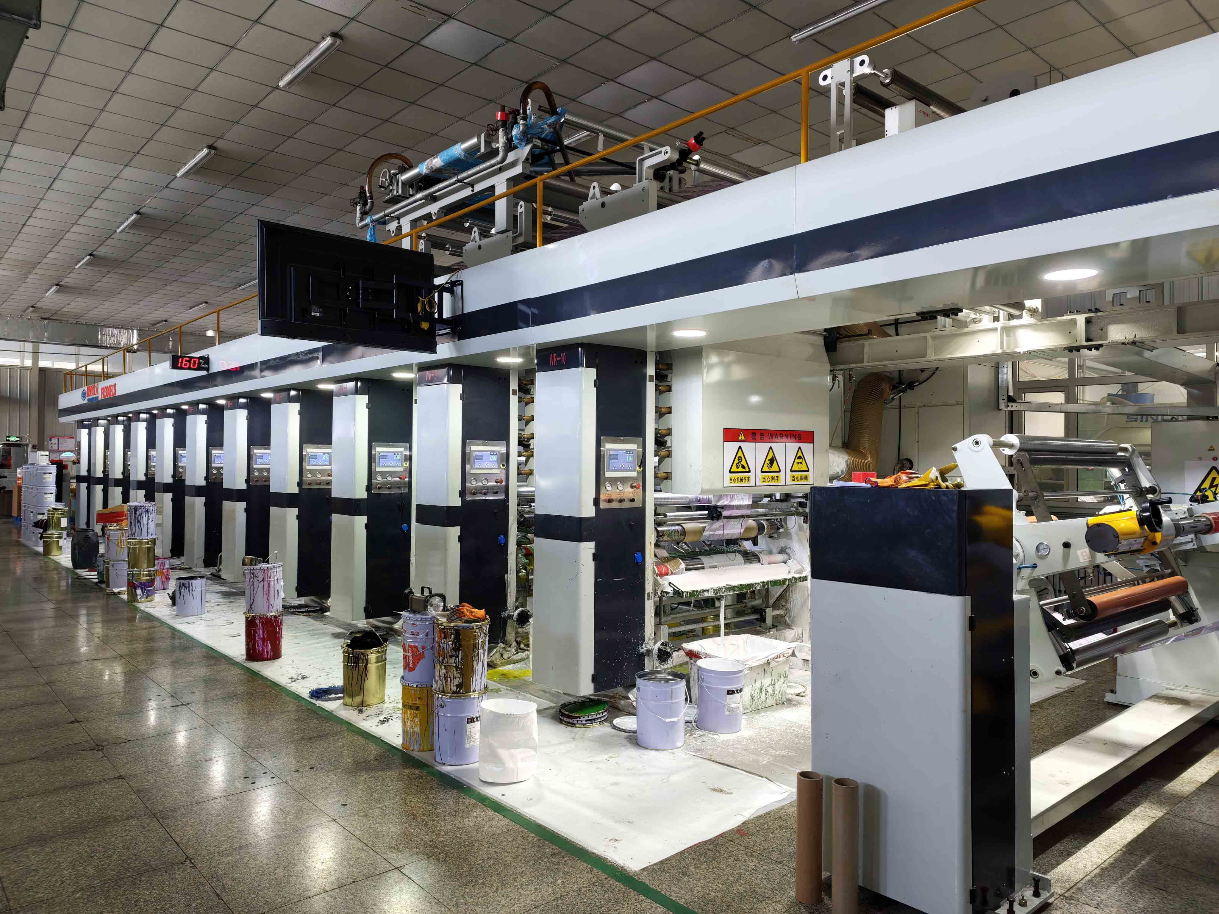
Digital and gravure printing are both viable for custom flexible pouches. The right comparison uses the same dimensions, material structure, finish, number of artworks, quantity per artwork, proofing expectations, and reorder scenario. A low initial print setup cost does not automatically make an option cheaper for a large repeat run; a low printed unit price may be misleading if the brand changes flavors every few months.
Ask the supplier to recommend the route for your quantities. The site shows both digital printing and gravure printing as options, but that list is not a quotation or a guarantee of a particular minimum order or schedule. Provide the SKU counts and forecast, then compare written offers on the same basis.
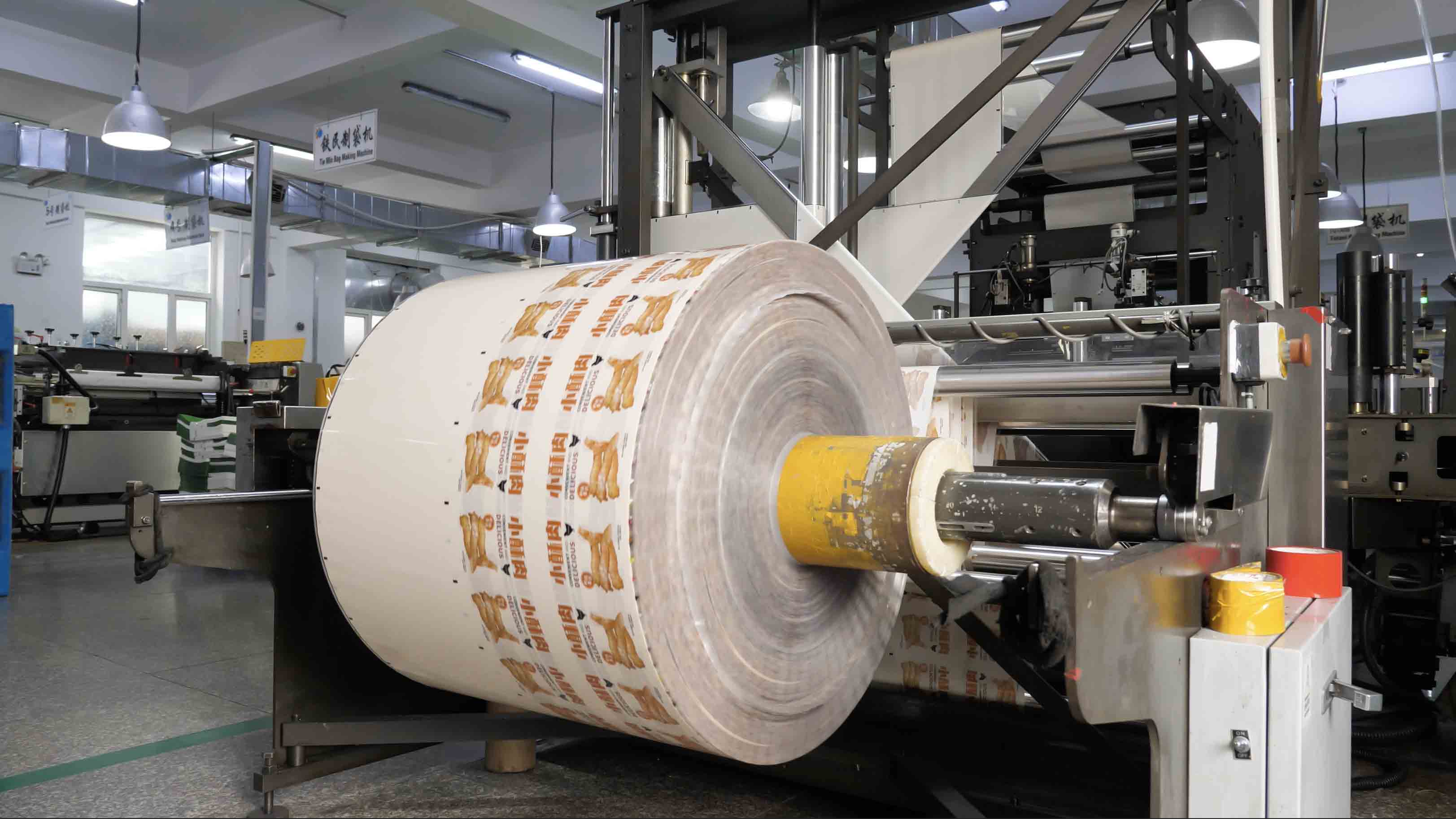
Color approval deserves its own record. State whether the reference is a physical swatch, a press proof on the specified film, or another agreed standard. Record which panels and colors matter most to the brand. Matte and glossy areas, kraft appearance, metallized effects, and windows can all change how a design looks under different lighting. A screen mockup cannot settle that discussion. A sample from another substrate is useful for direction, but it is not the final acceptance standard unless both sides explicitly agree.
What the New Zealand 80 g case actually shows
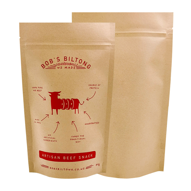
The published New Zealand 80 g meat-snack pouch lists a stand-up format, a resealable zipper, MATOPP/kraft paper/VMPET/PE construction, gravure printing, and a 13 × 21 + 4 cm size. The photographed pack identifies its contents as biltong. It is appropriate here as a real example of a printed meat-snack pouch; biltong and beef jerky should not be treated as interchangeable processing or shelf-life categories.
The useful design lesson is the connection between an exterior look and a full package specification. A kraft-facing graphic direction is visible to the buyer, while the laminate and closure have separate engineering roles. The pack has front and back surfaces that can be assessed on a real object. The case also reminds us to verify how a zipper, tear feature, and filled gusset affect the artwork in three dimensions.
It does not provide independently documented conversion-rate improvement, longer shelf life, or repeat-purchase figures. Those claims appear in promotional copy on the case page, but no test conditions or commercial evidence are available there. We do not use them as proof. A buyer can reasonably ask for the material specification, a printed sample, and project-specific fill and seal validation; results for one snack and one order should not be assigned to another product.
When using this example in a design meeting, put the physical sample beside the flat artwork. Mark where the brand identity reads immediately, where the small print begins to compete with the folds, and how the closure changes the top edge. Then ask how the same design system would handle a second flavor. This is a better test of a proposed design than calling a pouch “premium” and leaving the production questions unanswered.
Approve the design on real filled and handled pouches
An empty flat pouch can look excellent and still fail the moment normal product is added. Make a short run of representative filled samples when possible. Include a typical lot and pieces near the largest expected size. Use the actual filler or a trial that reflects its motion and opening access. The packer should document whether it can keep product clear of the top seal and whether the planned tear and reclosure features function after sealing.
Review the same samples from several perspectives:
- Front presentation: Can someone identify product and flavor quickly at actual scale and in a small photograph?
- Back-panel readability: Is approved text legible after the bag curves and the gusset opens?
- Window truthfulness: Does it show a representative product view after normal settling?
- Handling: Do print, finish, corners, and folds remain acceptable after the planned handling trial?
- Opening: Can a user follow the tear path without destroying the information or disabling the zipper?
- Production consistency: Do several normally filled pouches look and seal similarly, rather than only one hand-arranged sample?
Photograph the filled pack upright, lying down, in its proposed carton, and after a handling trial suited to the distribution route. Compare those images with the approved mockup. If the product hides behind the lower gusset, or the front bulges so the name curves out of view, revisit the bag geometry or artwork. If the top seam collects pieces, redesign the filling and clearance before arguing over a finish.
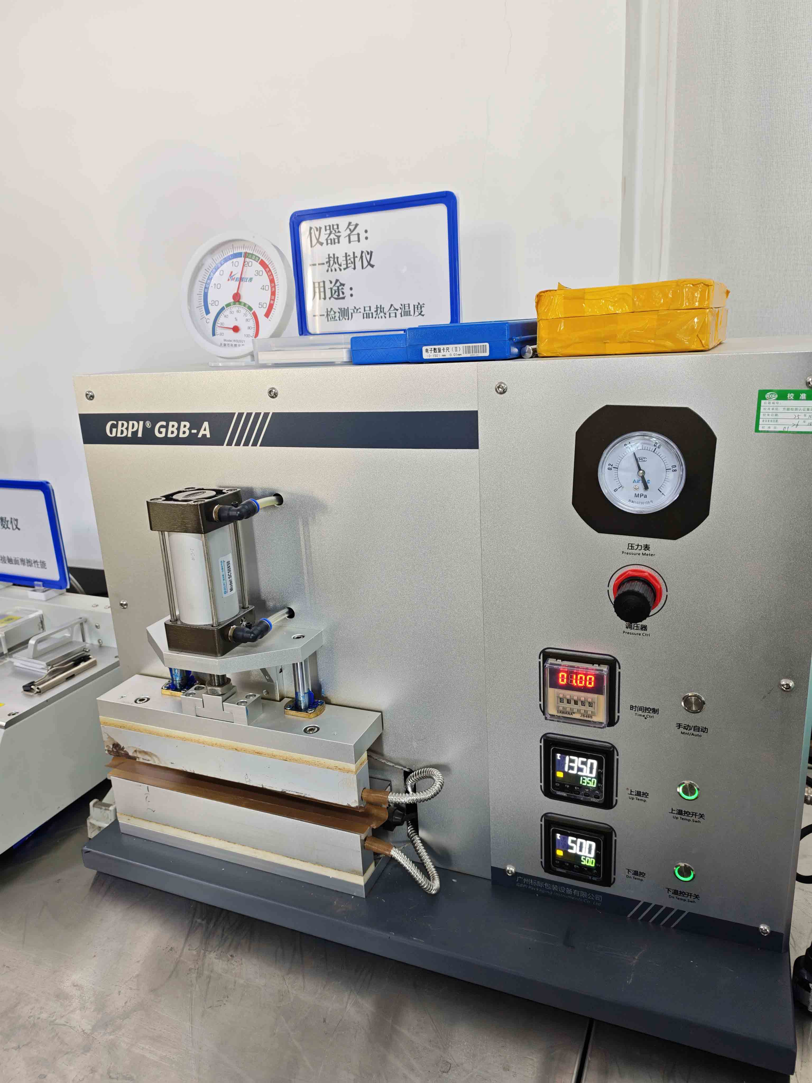
No single generic test number releases every project. The packer's product and equipment, the selected pouch, the sealing parameters, and its quality plan determine the appropriate acceptance criteria. Ask who records the result, how failed samples are handled, and which changes trigger another trial. Artwork approval and pack performance approval should meet at a named release gate.
A practical design scorecard
Use a simple scorecard with observations rather than adjectives. Record the measured pouch dimensions and fill weight, then score recognition, readable information, filled silhouette, opening and reclosure, window appearance if present, print/finish consistency, and condition after handling. Attach photographs and the SKU/version. Mark each item pass, revise, or not applicable, with the reviewer and date. The value lies in comparing the next revision against the same criteria, not in creating an impressive total score.
If marketing, quality, and the packer disagree, keep their findings separate. Marketing can say the flavor cue disappears in a thumbnail. Quality can say the printed allergen text does not match approved copy. Production can say the opening is too narrow for normal pieces. Those are three different problems and may need three different corrections. Approving a new color cannot fix a narrow opening.
What to send with a request for quotation
A supplier can respond more usefully to a small, complete package of information than to “quote a premium jerky bag.” Send the product sample or dimensions of representative pieces, target net weight, preferred bag format and display method, intended filling and sealing process, closure needs, planned market, number of SKUs, quantities per SKU, desired look, approved label status, and target launch window. Ask for blank or similar-material samples before fixing the artwork if the structure is still under review.
The quote should distinguish material construction, printing route, setup or artwork costs, features, sampling, delivery assumptions, and what is excluded. Request the final dieline and a defined approval sequence. If a supplier proposes an alternative size or structure, ask which physical trial will verify it. A purchasing team can compare two options fairly only when their specifications and acceptance tests are visible.
For a custom project, the beef jerky bags page is the appropriate starting point. Send the actual product and a brief, not just a rendered logo. That makes the next conversation about a usable pouch and a controlled design release. Food safety, inspection status, product claims, and shelf-life validation remain with the responsible food business and its qualified partners.
FAQ
What are some beef jerky packaging designs for a new brand?
A compact flat pouch, stand-up zipper pouch, flat-bottom pouch, and gusseted bag are four practical starting directions. Choose among them using the real product, target fill, shelf or peg display, filling method, approved label content, and budget. Compare full-size printed and filled samples rather than judging only renderings.
Does a window make a beef jerky bag sell better?
There is no universal sales result. A window can show the actual product when the filled meat sits behind it and the view stays appealing after handling. It also removes artwork space and changes the package construction. Test a windowed and an opaque version with the same product, then evaluate readability, appearance, and the validated barrier specification.
Should I choose digital or gravure printing for several flavors?
Quote both, if appropriate, against the same pouch structure, size, finish, SKU count, quantity per SKU, setup, proofing, revisions, and reorder plan. Many small or frequently changed artworks raise different questions from stable, large repeat orders. The production recommendation should follow the actual forecast and the supplier's written offer.
What should a print-ready jerky pouch file include?
Use the supplier's final, version-controlled dieline; agreed production artwork format; linked or supplied assets; color and finish references; a SKU/version matrix; approved label copy; marked variable-code space; and a map of seals, folds, zipper, tear notch, window, and hang hole as relevant. Agree in writing on proof and filled-sample approval before the run.
Can the packaging supplier approve my meat-product label?
The supplier can help reserve workable space and print approved content. The responsible food business and its qualified regulatory team must determine and approve the wording, claims, required information, and applicable inspection or label-approval process. For US meat products, review current USDA FSIS materials for the particular product and channel.
How do I package beef jerky for maximum sales?
No bag format or finish guarantees maximum sales. A useful design process makes the product and flavor easy to identify, keeps approved information readable, works on the packing line, and presents the real filled product honestly. Test those conditions at shelf and thumbnail size, then compare customer questions and actual commercial results once the brand has data.
Editorial/source notes (not article body): The case page supplies the published configuration, not verified food performance or commercial outcomes. Official label references: USDA FSIS mandatory-features checklist, 9 CFR 317.2, and USDA FSIS label approval guideline. Figure sources are the verified product and factory image URLs above.