Cannabis Packaging Design: How to Prepare Artwork for Custom Pouches
Cannabis packaging design is not finished when a pouch looks good on a screen. It becomes production-ready when the artwork, pouch format, printable panels, material direction, filling process, and market requirements have been considered together. A beautiful front panel can still create unnecessary revisions if it ignores the top-seal area, side gussets, windows, required information zones, or the dimensions of the final pouch.
This guide is for brands preparing artwork for custom pouches. It explains how to turn a visual direction into a clearer packaging brief, how to avoid treating a flat design as a finished production file, and what to confirm before a sample or print discussion. It does not provide legal advice, set a universal design rule, or promise that any artwork will meet every market requirement. Brands should confirm the current packaging and labeling rules for the markets where their products will be sold.
Start with a packaging brief, not a moodboard alone
A moodboard can be a valuable starting point. It communicates tone, colour, texture, retail references, and the kind of customer experience a brand wants to create. But it cannot by itself tell a packaging supplier which pouch is needed or where production allowances belong.
Build the design brief around a short set of practical inputs: product category, approximate fill, preferred pouch style, planned size, number of artwork versions, material or finish direction, closure features, filling process, target market, and any known information panels. When a decision is unknown, label it as unknown. This gives the design and packaging teams something concrete to discuss instead of silently treating an early concept as a final specification.
| Brief item | Why a designer needs it | Why a supplier needs it |
|---|---|---|
| Product and target fill | Helps shape the visual hierarchy and scale | Keeps format and pouch volume discussion tied to the real product |
| Pouch format | Determines usable panels and folded areas | Defines the physical construction that artwork must fit |
| Artwork count | Establishes whether this is one design or a system | Helps scope coordinated design versions and print preparation |
| Finish direction | Turns a visual preference into a discussion point | Connects the look to available material and print options |
| Target market | Identifies where market-specific information may be required | Prevents a generic mockup from being mistaken for final legal packaging |
The best briefs do not attempt to solve every technical question in advance. They make the creative objective and operational constraints visible at the same time. That is especially important when the brand has a strong visual point of view but has not yet selected between a flat pouch, stand-up pouch, or another format.
Choose the pouch format before finalizing the composition
A flexible pouch is not a blank rectangular canvas. Its front, back, side gussets, bottom fold, zipper area, tear notch, and top-seal area can all affect what is visible at retail and what should remain free of critical artwork. The same visual system may adapt across formats, but it should not be copied into each one without checking the actual panel geometry.
For example, a flat pouch can create a compact, graphic-led presentation. A stand-up pouch can provide a different front-panel proportion and shelf posture. A gusseted or flat-bottom direction can introduce additional surfaces and folds that deserve their own artwork planning. The correct choice depends on the product, filling process, shelf objective, and project requirements, not on one mockup image.
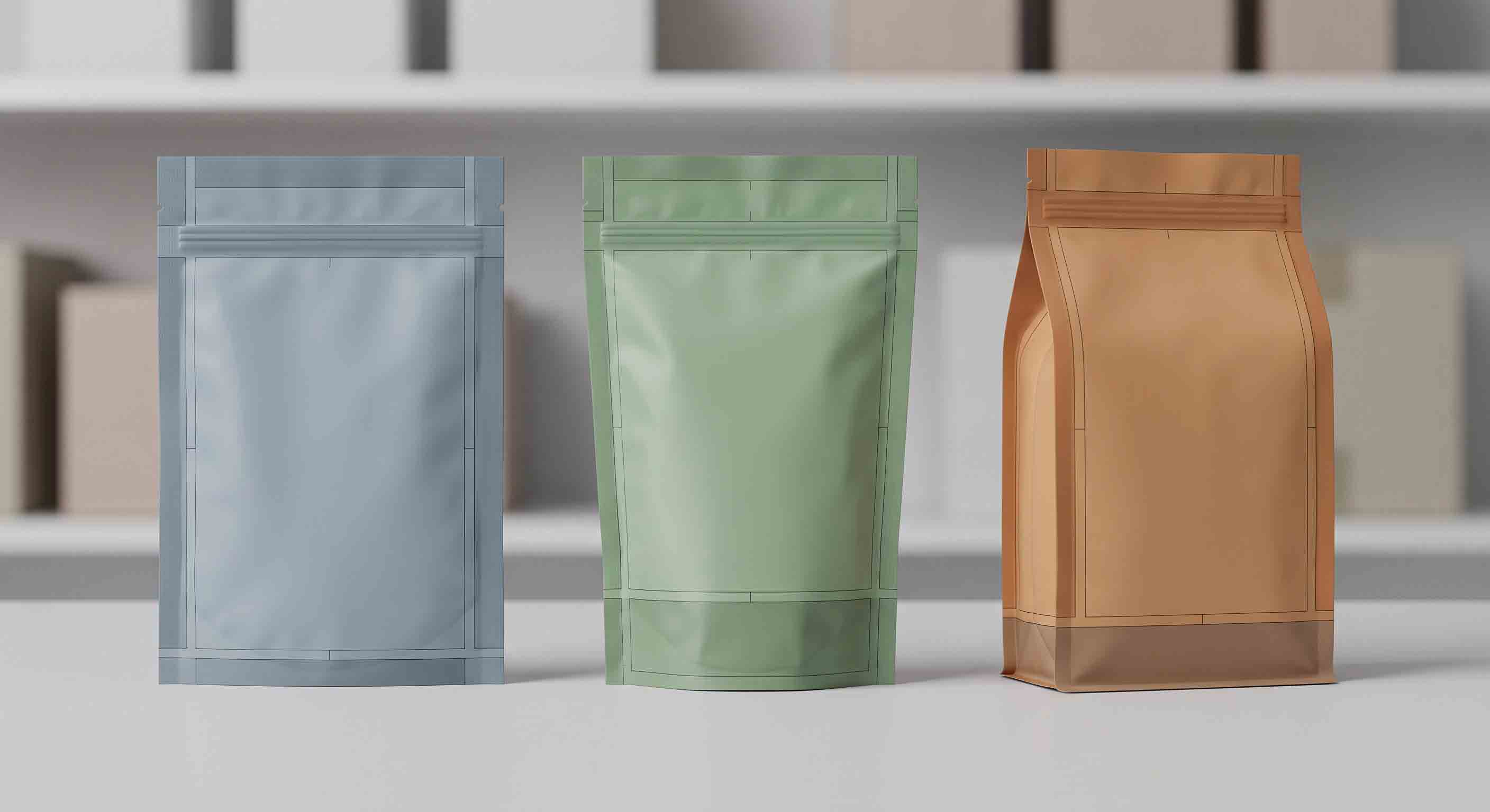
Ask these questions before committing to a design layout:
- Which panel is expected to carry the primary brand message or product identity?
- Which areas fold, curve, seal, or sit beneath a zipper?
- Does the product need a window, and if so, what should that window show?
- Which panels may need market-specific information later?
- Will the same design be adapted to more than one pouch size or format?
This does not mean the designer must leave the packaging visually empty. It means that important artwork should be placed with the real pouch construction in mind. A strong system uses the available panels intentionally instead of discovering them after a design has been approved internally.
Treat printable areas, bleed, and seal space as part of the design
Design files are often created as flat artboards, while a finished pouch has edges, folds, seals, and production allowances. The artwork should be discussed against the supplier’s final template for the selected pouch. That template is the reference for final panel dimensions, bleed, safe placement, and areas affected by sealing or converting.
Do not assume a design that reaches the edge of a screen can safely carry a logo, product name, or essential information to the edge of a pouch. Critical content should be positioned within the supplier-confirmed safe area. Background colour or non-critical pattern may extend into bleed where appropriate, but the final dimensions and tolerances must be confirmed for the actual production format.
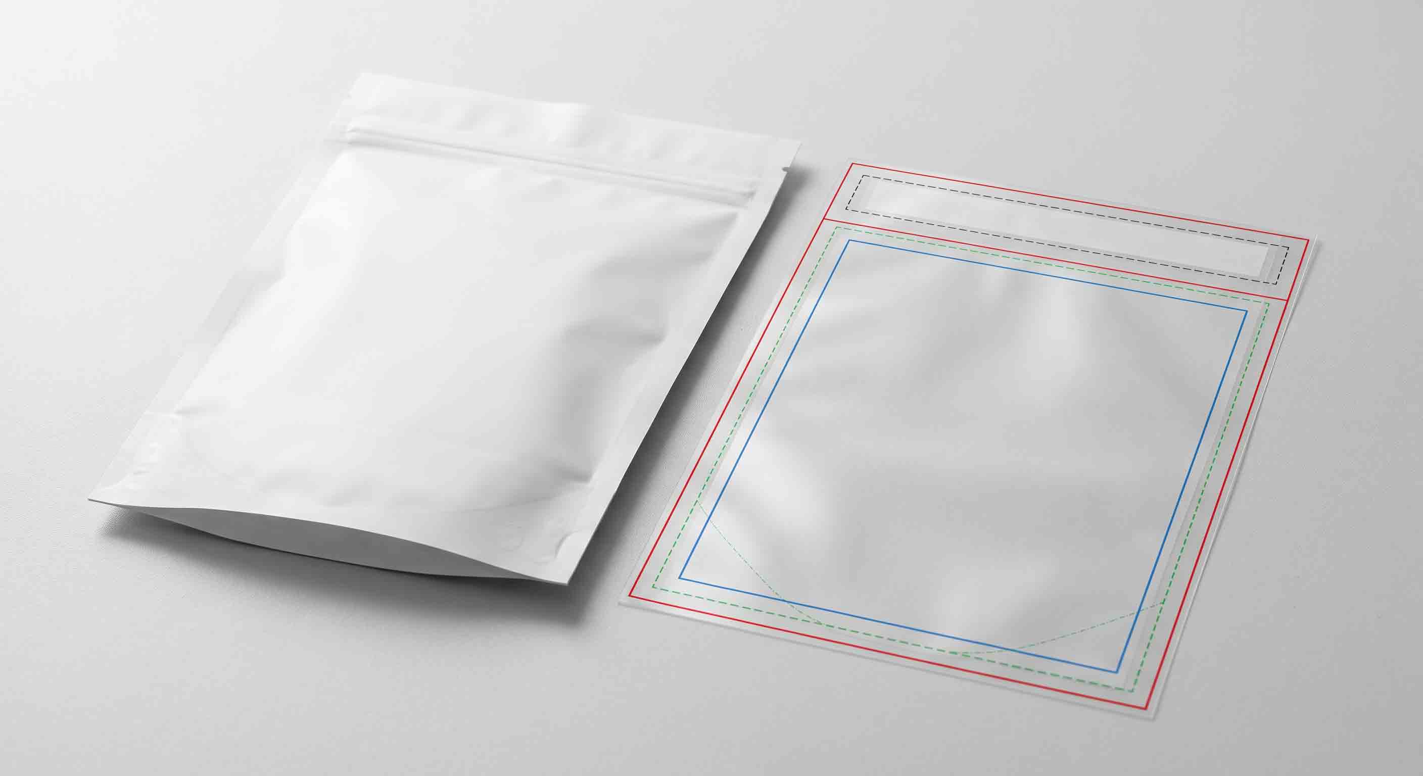
| Layout area | Design purpose | Practical approach |
|---|---|---|
| Safe area | Keeps critical visual or information elements away from uncertain edge zones | Place essential elements only within the supplier-confirmed area |
| Bleed area | Allows background artwork to run past the finished trim edge | Extend non-critical backgrounds according to the approved template |
| Top-seal area | Provides space for a finished seal above the closure where relevant | Avoid placing essential visual information where the seal may affect it |
| Gusset or fold | Adds surface area but can distort or hide artwork in use | Treat it as a separate design plane, not an invisible extension of the front panel |
The file format matters, too. A professional graphic application such as Adobe Illustrator supports precise vector artwork for print-oriented design work, but the software alone does not make a file production-ready. The final pouch template, linked image quality, colour setup, and supplier review still determine whether the artwork can be prepared correctly. Adobe Illustrator overview is useful background for vector-based design work.
Build visual effects around real material direction
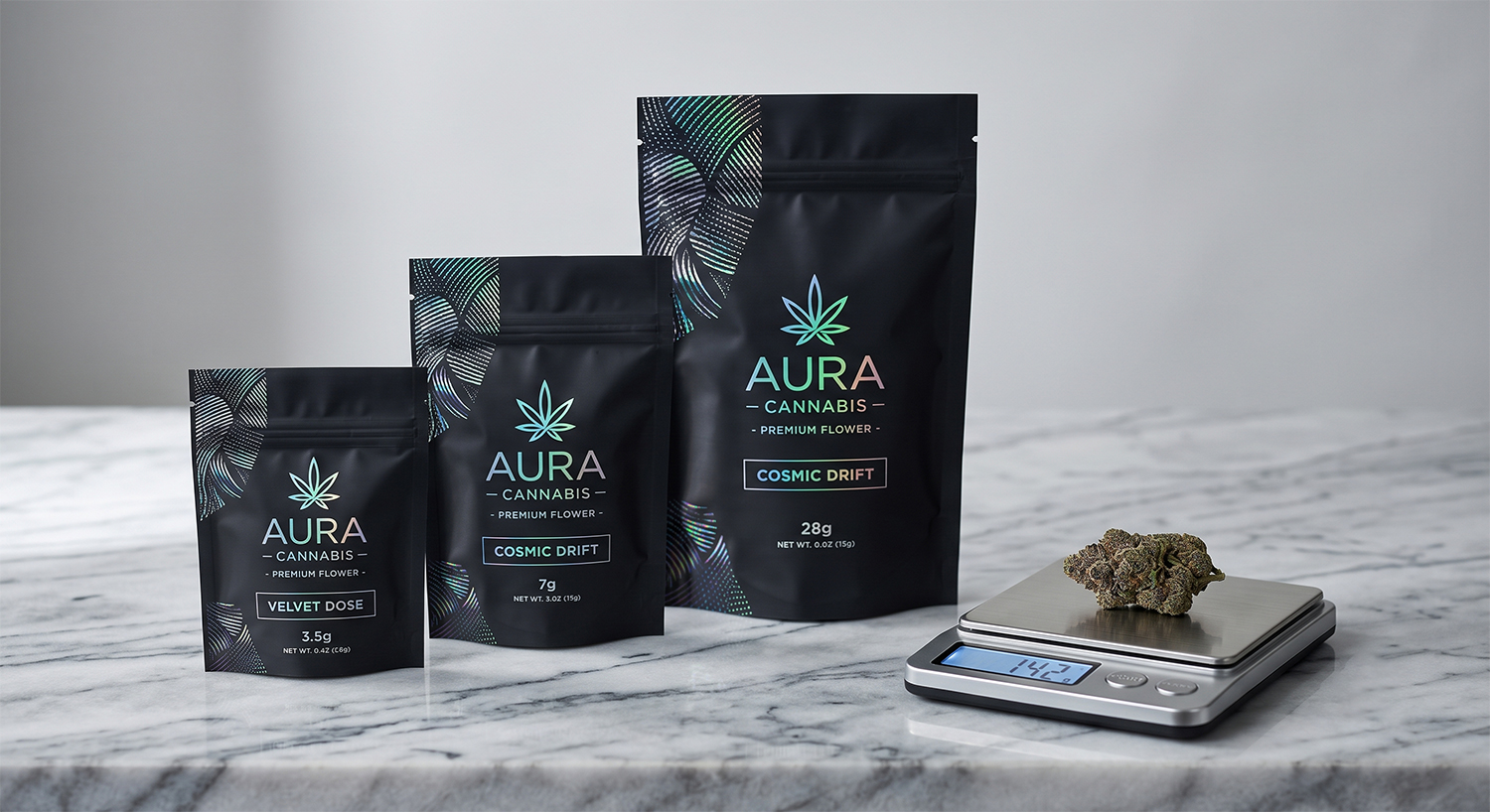
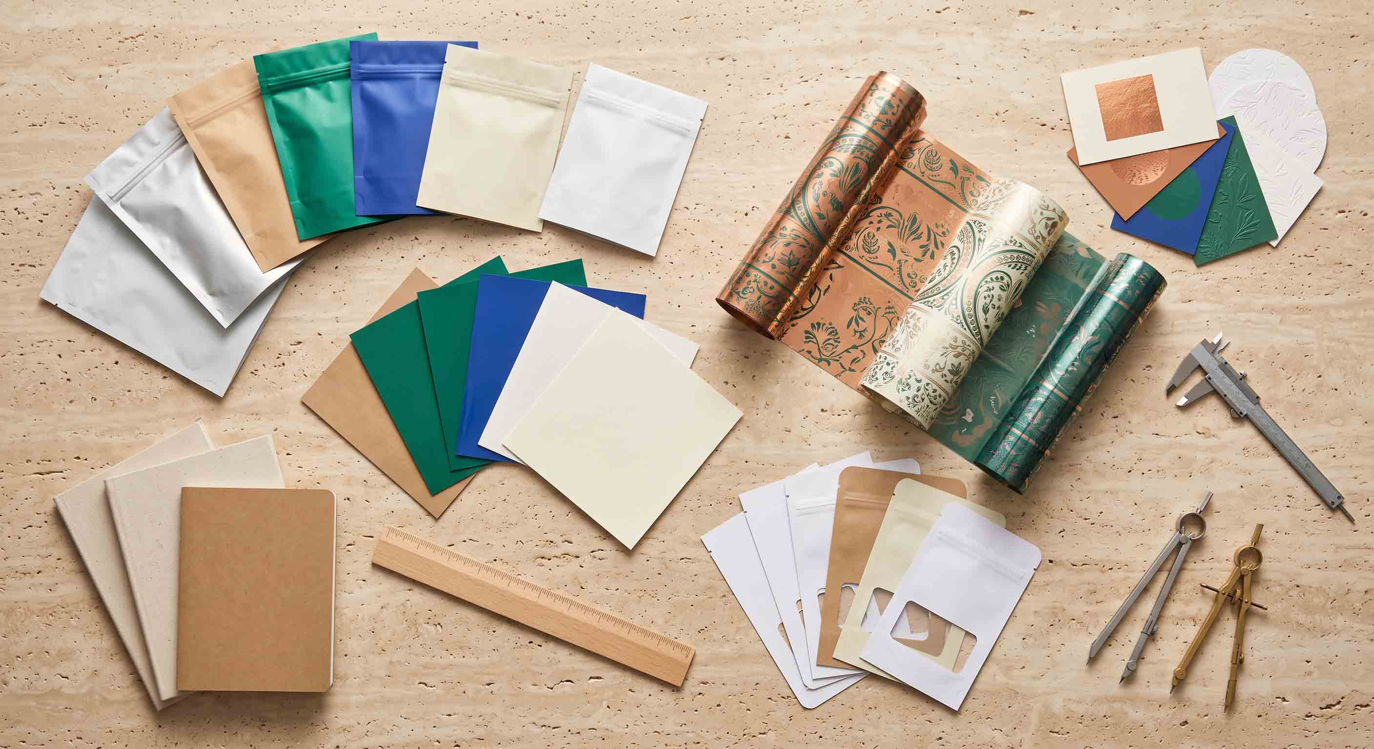
Matte surfaces, gloss contrast, holographic accents, metallic effects, soft-touch films, and clear windows can all shape a packaging identity. They should be treated as material and print directions, not generic filters added late in a design presentation. A glowing digital mockup may not communicate how a finish will look on a particular flexible material, under retail lighting, or beside a neighbouring SKU.
Describe the intended effect in simple visual language. For example: a matte cobalt pouch with restrained metallic linework; a warm natural surface with a limited clear window; or a colour-led collection with one controlled holographic accent. Then ask how that direction can be evaluated through the proposed pouch material and sample process. This produces a more useful conversation than asking for “premium” without defining what premium means to the brand.
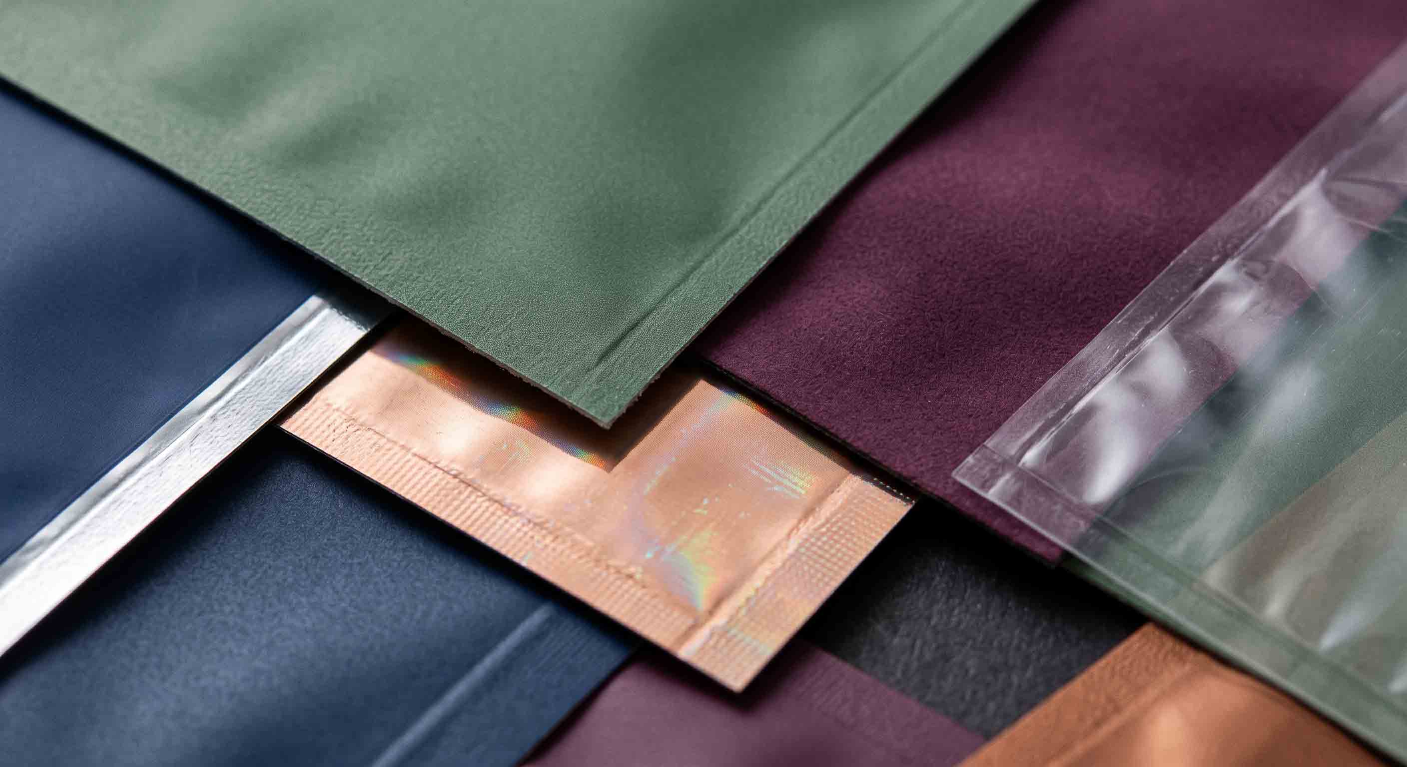
Printed graphics and coatings should also be reviewed as part of a packaging system. ASTM F2252/F2252M describes a practice for evaluating ink or coating adhesion on flexible packaging materials; it is not a universal acceptance promise for a specific project. Use it as a technical reference point when a project’s validation plan calls for relevant discussion. ASTM F2252/F2252M
Design a SKU system, not six unrelated pouch fronts
Many cannabis brands need more than one pouch design. Product type, format, size, or internal product category can create several variants that still need to look like one collection. The challenge is not merely choosing several colours. It is deciding what stays constant and what is allowed to change.
Define the fixed elements first. They may include a layout rhythm, recurring pattern language, material direction, product-identity location, or hierarchy between main and secondary panels. Then define the variables: colourway, product illustration, finish accent, window shape, or size-specific adjustment. This approach gives a growing range visual discipline without forcing every SKU into a rigid duplicate layout.
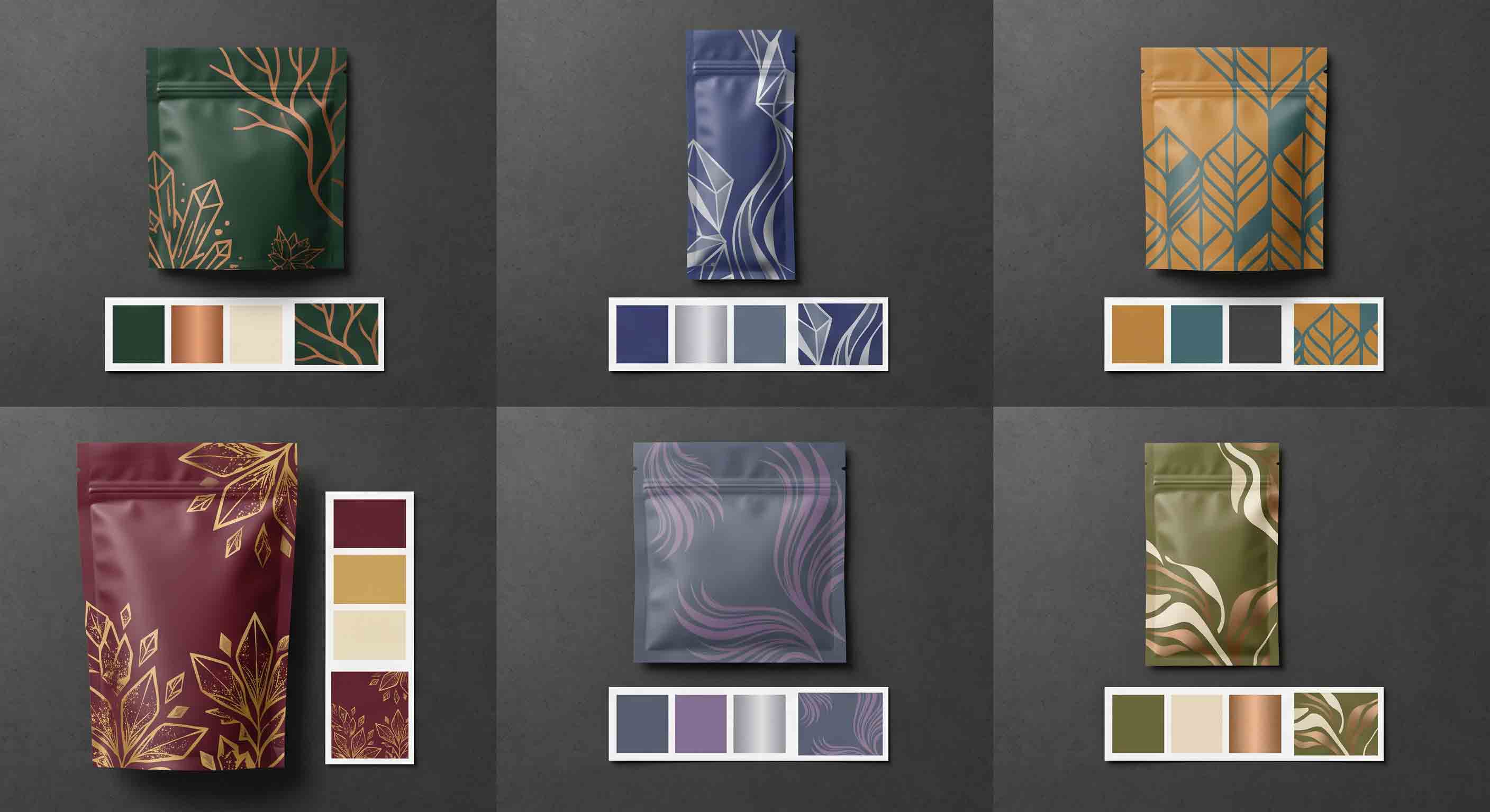
| Keep consistent | Vary only when the product needs it |
|---|---|
| Overall grid and primary identity zone | Colourway or visual motif |
| Typeface hierarchy and required-information plan | Product-specific panel content |
| Format-specific safe-area logic | Size, pouch format, or window placement |
| Finish strategy for the collection | A controlled accent that distinguishes a variant |
Before building every future SKU, decide which variants are actually needed at launch. This links design work to the ordering plan. Our custom cannabis packaging MOQ guide explains how format, artwork count, materials, and launch assortment should be discussed together rather than treated as unrelated decisions.
Keep market requirements separate from the brand concept
Packaging artwork often needs space for more than the brand concept. The applicable market may require specific information, warnings, symbols, or other content. Those requirements differ by jurisdiction and can change. Do not use a generic online pouch mockup as proof that a brand is ready for every market.
Instead, build an information plan early. Identify which content is provided by the brand, which content is supplied by a processor or other responsible party, and which areas must remain adaptable until final market review. This protects the design process from being interrupted late by information that has no remaining space.
New York’s current adult-use guidance is one example of a market-specific framework for packaging and labeling. It should be read only as an example for brands operating there, not as a universal rule for every cannabis product or location. New York OCM packaging and labeling guidance provides the applicable local reference.
Avoid letting an attractive mockup become a false production promise
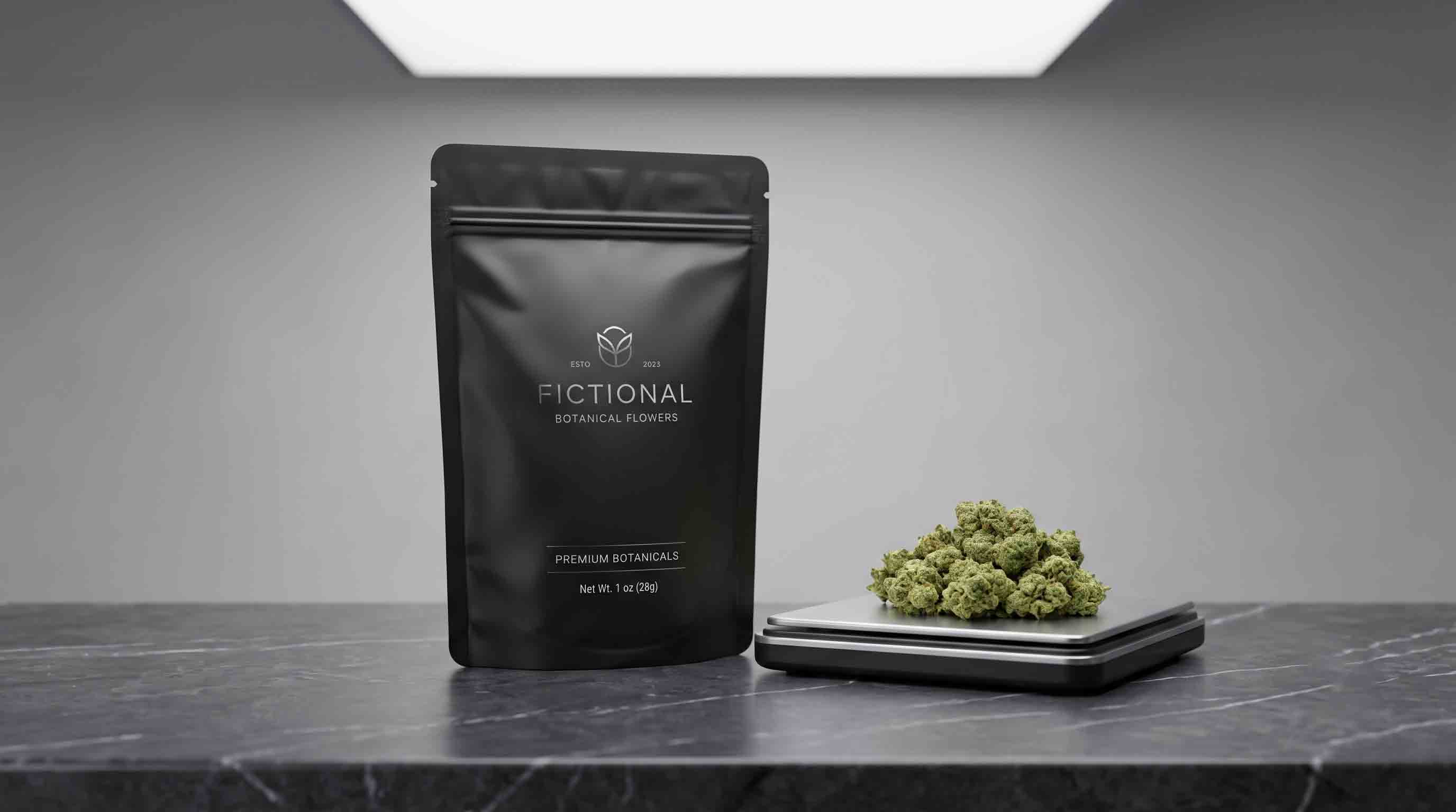
Mockups are useful because they help a team discuss proportion, colour, finish direction, and shelf presence. They are not evidence that a particular pouch has been tested, approved, or accepted by a market. A screen image cannot prove how a printed colour will appear on a selected material, whether a closure is suitable for the final process, or whether a required information panel has been reviewed.
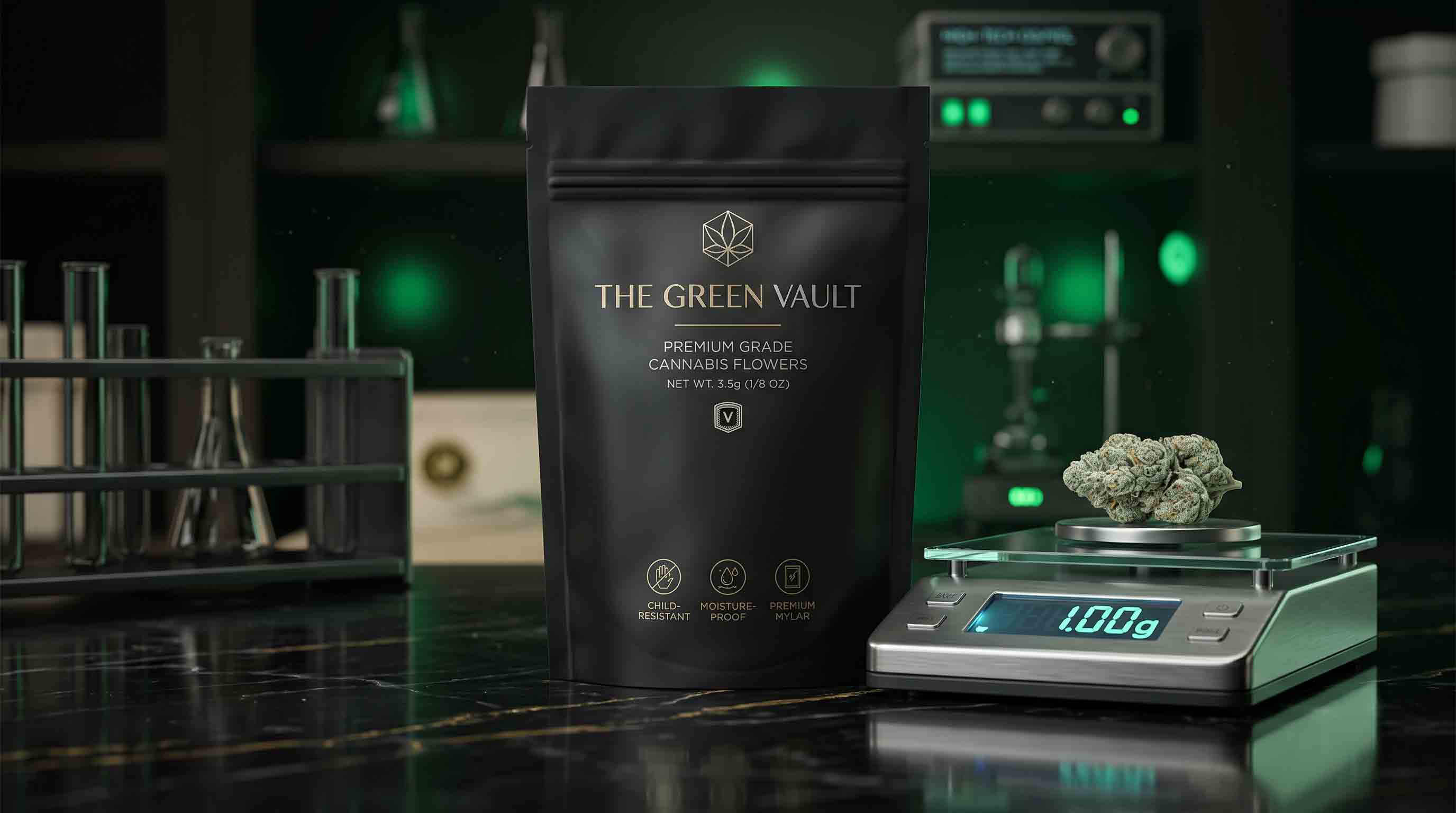
Use mockups honestly. They should show a proposed visual direction, not simulate certifications, warnings, laboratory results, child-resistant claims, product potency, or performance statements that have not been supplied and approved. If the brand intends to use a particular symbol, regulatory panel, or product statement, reserve space for it in the layout plan and confirm the final content with the responsible party.
This boundary makes creative work stronger rather than weaker. Designers can concentrate on hierarchy, colour, typography, pattern, and tactile direction without accidentally turning an exploratory image into a legal or technical assertion. Suppliers can then review the actual production constraints when the pouch template and market-specific content are known.
Review the file at the same scale as the finished pouch
Artwork can look balanced on a large monitor while becoming crowded on a small pouch. Before final approval, review the design at the intended physical scale. This is not a substitute for a finished sample, but it helps the team see whether the main identity, required information zones, and visual details are competing for the same space.
Check the smallest planned pouch first. If a family includes several sizes, the smallest format often reveals which elements need to be simplified or moved. Keep patterns and backgrounds flexible enough to adapt, while protecting the hierarchy that makes the collection recognizable. A visual system should be able to expand or contract without losing its essential structure.
Also review the design from the way a buyer will encounter it: front-on, slightly angled, and among neighbouring products. This helps separate a distinctive visual feature from a detail that is only visible in a full-screen mockup. The goal is not to predict every retail environment; it is to ensure the brand concept remains coherent when translated to a real flexible pouch.
Turn artwork into a production handoff
The final step is a shared review between the brand, designer, packer, and packaging supplier. It should confirm the chosen pouch format, dimensions, template version, artwork versions, material and finish direction, closure and top-seal considerations, filling process, market-specific information plan, and any sample questions. A single clean handoff prevents each party from working from a different assumption.
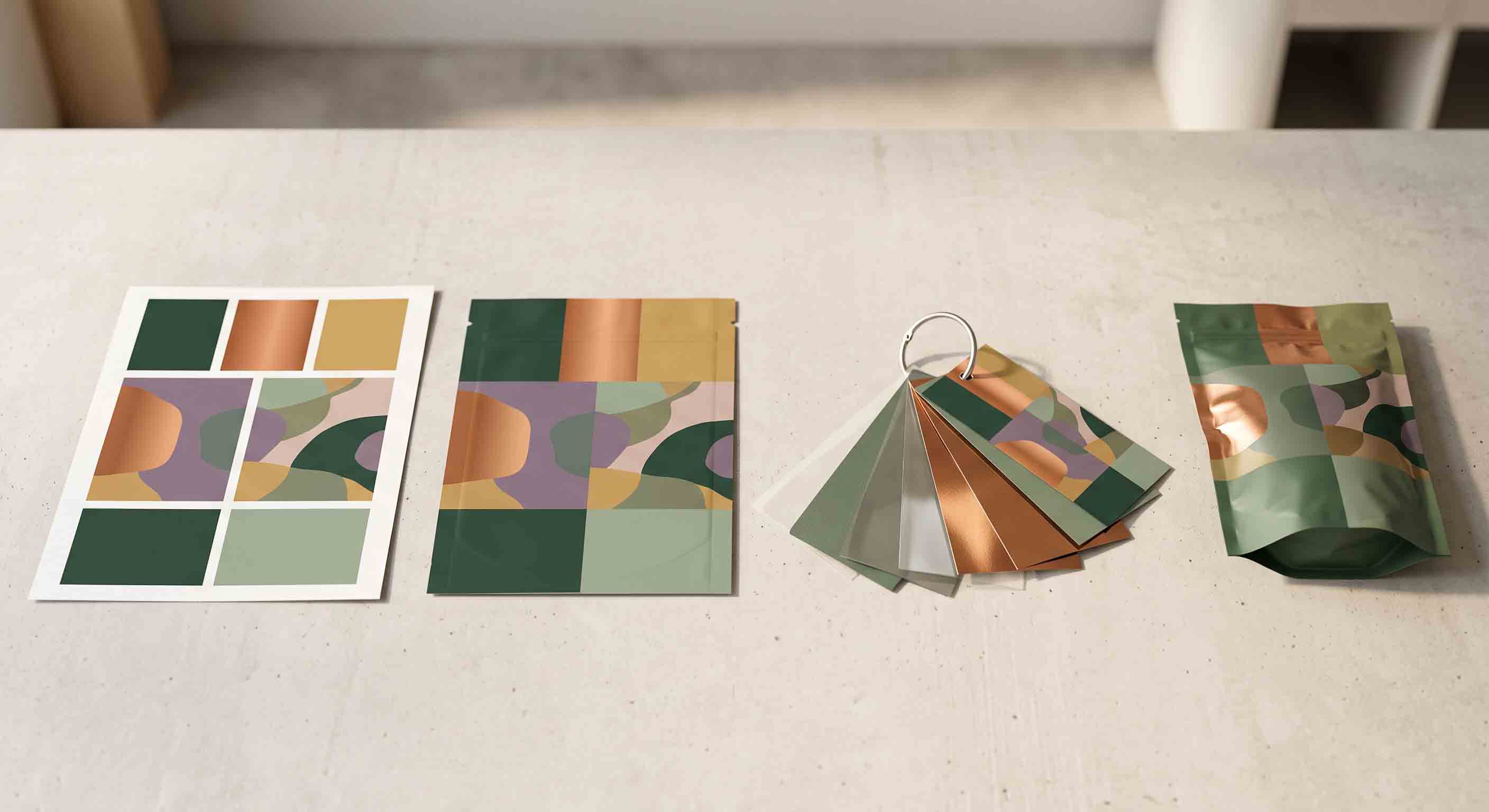
Use this handoff checklist:
- Confirm the exact pouch format and selected dimensions.
- Confirm which template version the design follows.
- List all launch artwork versions and their file status.
- Mark the intended finish, window, and closure directions.
- Identify the top-seal and essential-information zones.
- State how the pouch will be filled and sealed.
- Record the target market and the party responsible for final regulatory content.
- List the sample questions that must be answered before production.
A simple approval sequence
Keep approval stages separate. First approve the overall creative direction: the format family, visual hierarchy, palette, and material or finish intent. Next approve the selected pouch template and panel allocation. Then review the final artwork versions against that template, including the treatment of seals, folds, windows, and market-specific information areas. Finally, use the agreed sample or proof process to discuss the visible pouch direction before production.
Separating these stages gives every reviewer a clear job. Brand teams can decide whether the packaging feels consistent with the product. Designers can confirm that the visual system survives the pouch geometry. Packers can identify operational questions early. Suppliers can assess the defined pouch direction instead of guessing which version of a changing mockup is meant for production. If a decision changes, record the change in the brief rather than relying on an earlier email attachment or presentation slide.
For additional context on the finished-pouch side of this conversation, see our heat-seal, zipper, and packaging QA guide. Artwork and sealing are related through the real pouch construction, but they are not the same decision.
Recommended next step for a custom pouch design project
Once the product, format, artwork direction, and open questions are clear, a Custom Cannabis Packaging discussion can focus on practical pouch directions, printed visual options, material choices, and visible features such as a resealable closure, window, or finish. The final pouch recommendation should follow the actual product, packing process, target market, and approved design brief.
To start a productive inquiry, share your product category, target fill, proposed pouch format, target dimensions if known, artwork status, number of variants, finish direction, closure features, packing process, target market, and any documentation questions. Discuss a custom cannabis packaging project when you are ready to review a project-specific pouch and sample direction.
Keep version control simple and visible
Design approvals become difficult when several near-identical files circulate without a clear final version. Use a simple naming convention for internal artwork files and maintain one current brief that records the approved pouch format, template revision, number of SKU versions, and remaining open questions. A supplier does not need access to every early creative experiment; it needs the version that accurately represents the current production discussion.
When artwork changes after a sample discussion, send a short change summary with the revised files. Note whether the change affects only colour or copy, or whether it changes panel use, pouch dimensions, finish direction, window placement, closure position, or required information space. This reduces the chance that a production review is conducted against an outdated layout. Clear version control is an operational habit, not a design constraint, and it protects both the creative concept and the production handoff.
It also gives a future team member a clear record of why a production choice was made, even when the original designer, buyer, or supplier contact is not in the meeting.
Frequently asked questions
Should I design the pouch before choosing its size?
You can develop a visual direction first, but final production artwork should follow the selected pouch format, dimensions, and supplier template. This keeps essential elements aligned with the actual panels, folds, and seal areas.
What is the difference between bleed and a safe area?
Bleed is used for non-critical artwork that extends beyond the finished edge. A safe area is where critical content should remain within the supplier-confirmed template. Do not place essential design or information elements in bleed or seal-sensitive areas.
Can one design work across several pouch sizes?
Often a shared visual system can be adapted, but each format and size has different usable panels and proportions. Review every final layout against its own approved pouch template.
Can I choose a holographic or matte finish from a screen mockup?
A mockup can communicate direction, but it does not replace a material and sample discussion. Describe the intended visual effect and review it against the proposed pouch material and production process.
Do market requirements affect the artwork layout?
They can. Requirements vary by market and product. Plan adaptable information areas early and verify the current rules that apply to the actual target market before treating artwork as final.
What should I send to a packaging supplier with my artwork?
Send the product category, target fill, preferred pouch format, target dimensions if known, artwork files or visual direction, number of variants, finish and closure ideas, filling process, target market, and outstanding sample or documentation questions.